
Pop Art in modern design didn’t end in the 1960s. It dissolved into the visual language of modern brand design, packaging, and consumer culture so completely that most people stopped recognising it as a movement and started treating it as just the way things look. The bold flat colours, the thick outlines, the halftone textures, the self-referential wink at the consumer, none of that went away. It just stopped being called Pop Art. Here’s what you’ve been looking at.
Walk into any independent coffee shop, scroll through any streetwear brand’s Instagram, or pick up a craft beer can at your local off-licence. You’ll see it immediately once you know what to look for. Bold, flat colour. Strong outlines. A graphic confidence that doesn’t apologise for itself. Imagery that knows it’s imagery.
That’s Pop Art in modern design. It never left. It just became the wallpaper.
What Pop Art in Modern Design Is Actually Built On
Most people’s mental image of Pop Art stops at Andy Warhol’s soup cans and Roy Lichtenstein’s comic book panels. And while those are the movement’s most recognisable faces, they’re not really the point.
Pop Art emerged in Britain and America in the late 1950s as a deliberate provocation. At a time when the art world prized abstraction, emotional depth, and the singular genius of the artist, Pop Art looked at supermarket shelves, advertising hoardings, comic strips, and celebrity culture and said: This is also worth looking at. Mass production, commercial imagery, and everyday objects aren’t beneath art. They are art.
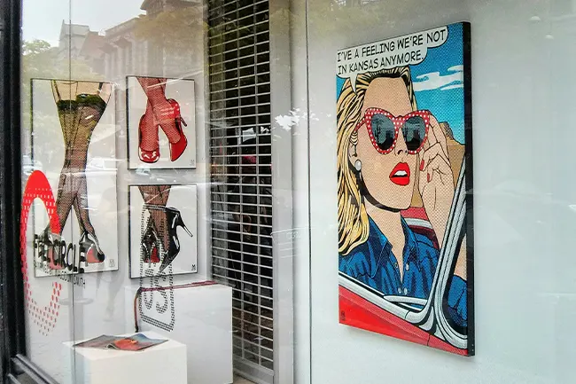
That was a radical position in 1958. In 2024, it’s the operating principle of half the brand design industry.
The movement’s core insight, that the visual language of commerce is a legitimate, even rich, subject for design, is precisely what makes it so durable. Pop Art wasn’t just a style. It was a way of thinking about images and what they communicate. And that way of thinking never went out of fashion because it was always just a description of how modern consumer culture works.
Where You’re Still Seeing Pop Art in Modern Design Every Day
Flat colour and bold outlines
The flat design movement that swept through digital and brand design in the early 2010s is often credited to Swiss minimalism and Bauhaus principles. Those influences are real. But the bold, unapologetic flatness of the best contemporary illustration-led branding owes just as much to Pop Art’s rejection of painterly depth and shadow.
Look at the illustration style used by independent food brands, direct-to-consumer startups, and music festival identities. The colours are unblended. The outlines are confident. The imagery is simple enough to read at a glance and bold enough to hold a wall. That’s not just flat design. That’s Pop Art logic applied to brand communication.
Ben-Day dots and halftone textures
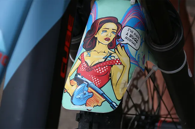
Lichtenstein’s signature technique, the mechanical halftone dot pattern used in cheap comic book printing, has become one of the most recognisable decorative elements in contemporary brand design. You’ll find it on craft beer labels, streetwear graphics, music merchandise, and independent packaging everywhere.
The irony is deliberate and very Pop Art. A printing limitation that originally signalled low-budget mass production has become a mark of considered, independent design. The texture communicates something: that the brand knows its references, that it isn’t taking itself too seriously, that it has a sense of its own visual history.
Pop Art’s Self-Referential Take on Consumer Culture
Pop Art was fascinated by brands. Warhol didn’t just paint Campbell’s soup cans because they were visually interesting. He painted them because brands had become the shared visual language of modern life, as recognisable and culturally loaded as any religious icon.
Contemporary brands have absorbed that lesson completely. The brands that resonate most with younger audiences are the ones that treat their own brand identity as a subject, that acknowledge the artifice of branding while committing to it fully. That self-awareness, that willingness to wink at the consumer, is pure Pop Art sensibility.
In Sticker and Print Designs
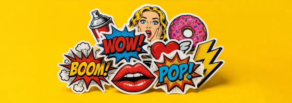
This is where Pop Art’s influence becomes most visible in most modern design trends. The thick black outline, borrowed from comic illustration and screen printing, is one of the most effective tools in contemporary brand design for a very practical reason: it works at any size.
A design with strong outlines reads clearly on a billboard and a custom sticker. It reproduces faithfully in print, on screen, and on merchandise. It holds up when scaled down and commands attention when scaled up. Pop Art’s graphic boldness wasn’t just an aesthetic choice. It was, and remains, an extremely practical one.
Why Independent Brands Keep Coming Back to It
Pop Art was always about democratising image-making. It took the visual language of mass production and handed it back to artists, designers, and eventually anyone with something to say. That democratising impulse maps directly onto the independent brand movement.
Small brands, independent makers, and direct-to-consumer businesses are drawn to Pop Art aesthetics for the same reason the original artists were drawn to commercial imagery: it’s immediate, it’s legible, and it doesn’t require the viewer to work hard to understand it. In a saturated visual landscape where attention is the scarcest resource, that directness is a genuine competitive advantage.
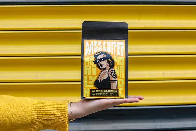
There’s also something about the attitude. Pop Art was never reverent. It was curious, playful, and slightly irreverent about the culture it was depicting. Independent brands that carry that same energy, that don’t take themselves too seriously while still caring deeply about craft, tend to connect with audiences in a way that more polished, corporate aesthetics struggle to replicate.
How Pop Art in Modern Design Translates Into Physical Brand Design
The place where Pop Art’s influence is most practically useful is in physical brand materials: packaging, labels, merchandise, and print. A bold, flat, high-contrast design doesn’t just look confident. It performs better in print.
Designs with strong colour blocking and clear outlines reproduce consistently across different materials and surfaces. They hold their integrity whether they’re printed on a kraft paper bag, a glossy product label, or a vinyl sticker. They don’t rely on subtle gradients or fine detail that gets lost at small sizes or on textured surfaces.
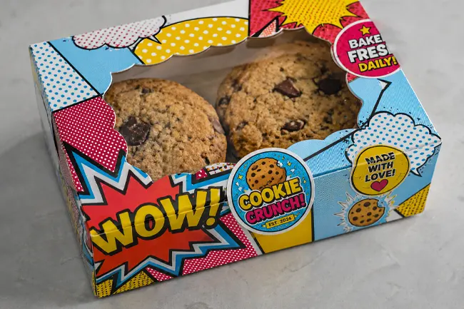
This is why so many of the most effective custom sticker designs borrow heavily from Pop Art principles, whether their designers know it or not. A well-designed sticker is bold enough to read at a glance, simple enough to reproduce faithfully, and confident enough to hold its own on whatever surface it ends up on. Those are Pop Art values. They always were.
If you’re thinking about where to source bold, graphic sticker designs for your brand or packaging, this guide to buying custom stickers in the UK is a useful place to start.
Read: Where to Buy Custom Stickers in the UK
Final Thoughts
The movements that last aren’t always the ones that stay in museums. Sometimes they last by becoming invisible, by dissolving so completely into the visual language of everyday life that people stop recognising them as a movement at all and start treating them as just the way things look.
Pop Art in modern design is everywhere. In the craft beer can on your kitchen counter, the tote bag by your front door, the sticker on someone’s laptop on the train. It’s in the bold colours and thick outlines of the brands that feel most alive right now.
You’ve been looking at it your whole life. Now you know what to call it.