

Your packaging tells a story before your customer reads a single word. The colours, the finish, and the weight of the material all communicate something about what’s inside and who made it. Your sticker is part of that story, and good sticker design works with the packaging rather than against it. When the two don’t align, customers feel the disconnect even if they can’t explain why.
Most brands never notice the mismatch. Customers do. They may not be able to explain why a product feels polished or pieced together, but they’re remarkably good at sensing the difference.
Here is how to think through the match before you order.
Start with the packaging surface, not the sticker design
The most common mistake brands make is designing the sticker first and thinking about the surface second. It should be the other way around.
The surface your sticker lives on influences almost every decision that follows: the material, the finish, the shape, and even how bold or minimal your design should be.
Before you design anything, ask yourself four questions:
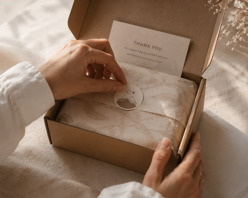
Is the packaging matte or glossy? A gloss sticker on a matte box can look tacked on rather than designed. A matte sticker on glossy packaging can feel intentionally considered.
Is the surface textured, smooth, curved, or flat? Textured surfaces and tight curves affect how stickers adhere and how edges sit.
Is the packaging dark, light, or transparent? A white sticker placed on dark packaging creates a very different effect from a clear sticker that lets the packaging color show through.
Will the packaging be handled a lot, exposed to moisture, or sit in a retail environment? That determines how durable your sticker material needs to be.
Get the surface right in your head first. The design decisions will follow more naturally from there.
Finish is a brand decision, not just a print decision
Most people think of matte and gloss as aesthetic preferences. They are actually brand signals.
Gloss reads as bold, energetic, and accessible. It makes colors pop and photographs well. It works for brands that want shelf presence: food and beverage, beauty products, and consumer goods that compete in a crowded retail space.
Matte is usually the quieter choice. It does not fight for attention; it earns it. It works for brands in the artisan, wellness, lifestyle, and independent design space where the aesthetic is part of the value proposition.
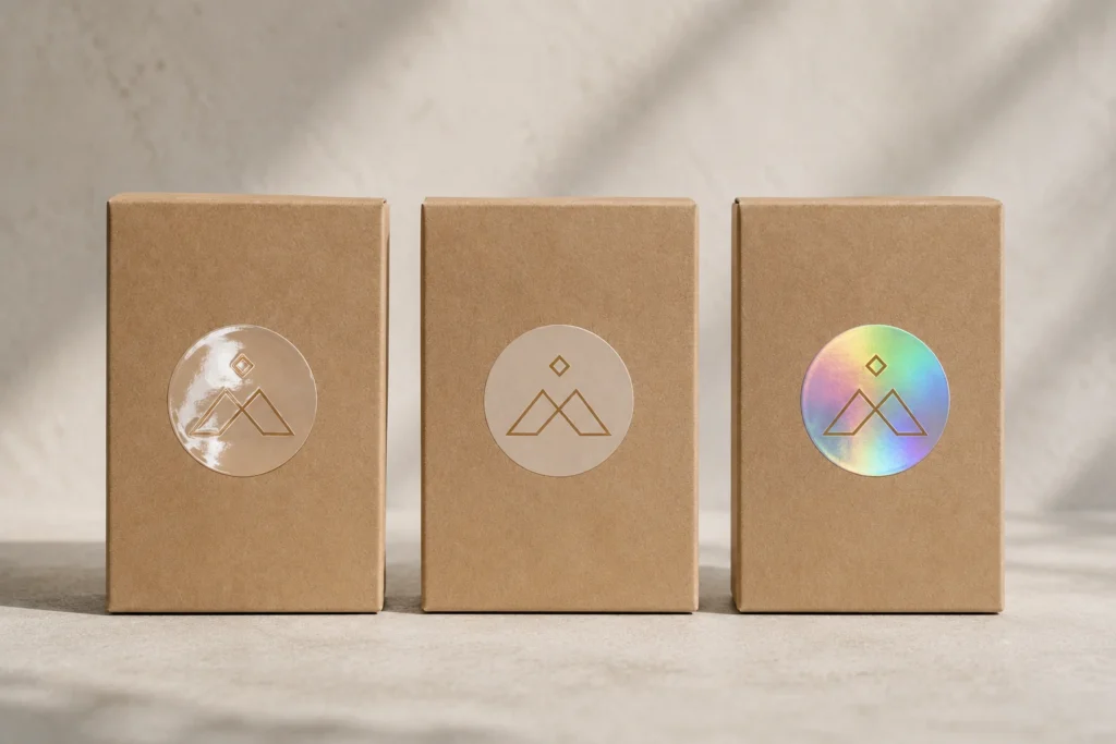
Specialty finishes (holographic, soft-touch, frosted) work when the sticker itself is meant to communicate that something special is inside. Limited editions, gift packaging, and premium tiers of an existing product line.
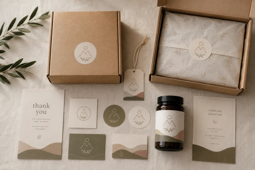
The question is not which finish looks better. It is which finish matches what your brand is already saying through the rest of your packaging. A soft-touch matte sticker on kraft paper packaging tells a coherent story. The same sticker on a glossy white box with bold typography tells a confused one.
If you’re unsure which combination works best, testing actual samples against your packaging is one of the simplest ways to avoid expensive mistakes. Most custom sticker printers offer free sample packs, making it easy to compare finishes before committing to a full production run.
Shape and size in your sticker design for packaging
Die-cut stickers remove the visual boundary between the sticker and the surface it sits on. The design becomes part of the packaging rather than something applied to it.
For brands where the sticker is a label, a seal, or a signature detail, a die-cut is almost always the stronger choice. It takes more thought in the design phase, but the result is a sticker that looks like it was designed for that specific product, not sourced and applied afterward.
Size matters differently. A sticker that is too small on a large surface looks like an afterthought. A sticker that is too large for a small product looks like it belongs on something else. The right size is not about filling space; it is about proportion. The same rules that apply to logo placement on packaging apply to sticker placement. It should look like it was always supposed to be there.
Color consistency between screen and print
This is where a lot of otherwise well-designed stickers fall apart. The teal on your packaging and the teal on your sticker are not automatically the same. Even if both files use the same digital color values, they may reproduce differently once ink meets paper.
Screen colors are displayed in RGB. Print colors are produced in CMYK. The conversion between them is not always clean, especially for saturated colors, pastels, and anything with a lot of blue or green. If your brand color is precise (a specific Pantone shade, a carefully calibrated hex value), you need to communicate that to your printer and confirm it holds through the proof stage.
Always approve a digital proof before your order goes to print. If color consistency is critical, request a physical proof. The few days it adds to your timeline are significantly cheaper than reprinting an entire order because the green on your sticker reads differently from the green on your box.

The coherence test for sticker design and packaging
Before you finalize any sticker order, do one thing. Put your sticker design next to your packaging, digitally or physically, and ask a single question: does this look like it was designed together, or does it look like two separate decisions? Try looking at it from a few steps away. Squint. Ignore the logo and read the overall impression instead. Does the sticker feel like part of the packaging, or does it compete with it? Good packaging systems don’t ask the eye to make separate decisions. Everything feels like it belongs together.
If it looks designed together, you are ready to order. If something feels off (the finish does not match, the colors are fighting, the size feels wrong, the shape creates visual noise), go back one step and identify what specifically is creating the disconnect.
The brands that get this right are not necessarily the ones with the biggest design budgets. They are the ones who treat the sticker as part of the packaging system, not an addition to it.

Final Thoughts
Stickers are small. Their impact on how a brand is perceived is not. When a sticker matches the packaging in finish, color, scale, and feel, it does something invisible but important: it makes the whole thing feel intentional. That intentionality is what separates brands that look considered from brands that look assembled.
Customers rarely remember why one package felt more premium than another. They remember how it made them feel. More often than not, that feeling comes from dozens of small decisions working together. Your sticker is one of them.