Though it seems significant, fonts have a lot of influence on whatever you’ll be designing. Use this blog to learn about font psychology and how it can affect you.
“Fonts have the power to invoke a strong reaction in people who sees them” – Linkedin
In the psychology of design, there are many ways for you to tap into people’s emotions. For example, you can use colours and shapes to influence what people feel when they see your brand. However, there is an important design element that many overlook – fonts. But how come they’re so important?
For thousands of years, humans have used writing as a medium of communication. Thus, fonts have actually been used since the dawn of human civilization. In order to maximise the impact of your designs, you’ll need to learn about font psychology.
In this guide, we’ll be going over the very basics and how they can impact your brand.
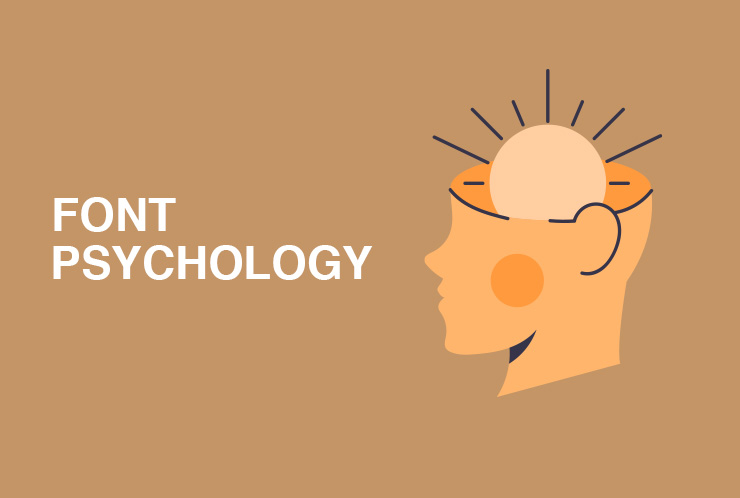
What is Font Psychology?
First, we need to know what exactly font psychology is. Simply put, it is a person’s emotional reaction to seeing a certain style of text. Because humans tend to be more visual, it is important to show rather than tell. As each person is different from the others, each design will affect a person differently.
You can use different branding strategies by thoroughly understanding and researching these reactions. Each font can become an advantage to you and your team, so think wisely about how to use them. Don’t forget that the industry you’re in factors into the choices you make. Just because a design is popular in one industry doesn’t mean it will be popular in yours.
The power of this philosophy is that it gives you and your designers a clear destination and goal. This will give you insight into how people react to the fonts they see. Now, you can design your product’s packaging or labelling according to what the customers want to see. You can use many kinds of stickers to make each style pop.
Why Should You Use This?
Combining the perfect fonts and ideas will generate excitement in your target audience. Each time you market a product, people will always look forward to its appearance.
Overall, using fonts is another part of the design process. For it to truly succeed, you need to ensure that the logo, colours, and shapes all work with your chosen font.
Types of Fonts and Their Meaning
Each font has a different meaning and characteristics. Let’s take a look at some of them and see what each one communicates:
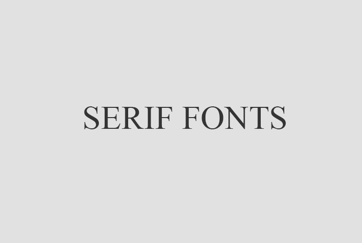
Serif Fonts: This type is quite common, being the most traditional of its counterparts. It is used to give a classic and traditional look. Because it is mostly used by established businesses with a long history, it creates an image of professionalism and trust.
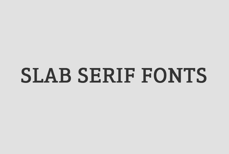
Slab Serif Fonts: The bolder sibling of Serif fonts, this style features a thicker look. It shares the same traits as its sleeker sibling: trustworthy and dependable. The only difference is that the Slab Serif appears distinct and confident. It should be noted that using these in the wrong context can make you appear confrontational.
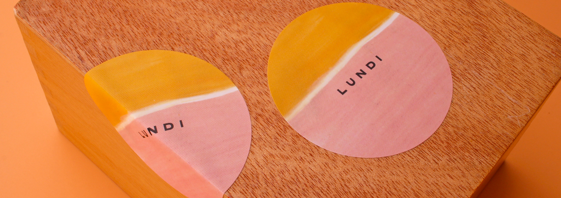
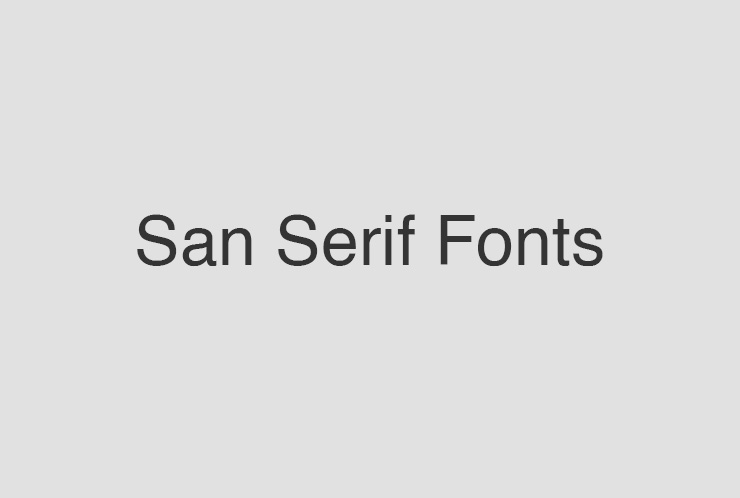
San Serif Fonts: This style is often associated with modernity and progressiveness. Its image of adventure breaks tradition. Most brands that use this type are tech companies like Google.
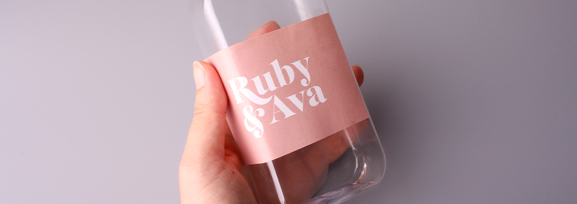
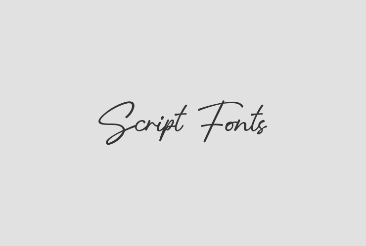
Script Fonts: With its handwritten look, this style gives off a feeling of elegance and creativity. The beauty of these fonts makes them a popular option among luxury brands and high-class restaurants.
There are multiple ways that you can make use of these for your business. You can create great business cards and give your clients the best first impression.
Final Thoughts
Font psychology can significantly help your business grow. Each one has different uses, helping you diversify the products you’re making. Combine this philosophy with other design methods to create powerful branding and marketing.