Innovation is an integral part of our lives. Every day, people look to make the next big thing that will change how humans live or create something that will entertain us in a better way. Businesses, especially, constantly need to innovate themselves in order to succeed. But unexpectedly, the graphic design industry is rather strict when it comes to creating and applying new design ideas. Because there is a demand for simplicity, many designers will often follow the established rules of thumb.
This is mostly seen when using colors. The general consensus is to use no more than two colors for the design. Of course, this is a good rule as it lets you create an attractive design for the customers. However, there are times when rules are broken. Today, we are going to talk about breaking the color rules and take a look at the ways this could be beneficial to you.
Here are some tips:
Breaking the Norm
In recent times, the trends of logos have become increasingly simple and monochromatic. As a result, it may become difficult for your clients to stand apart from the rest of the competition. While monochromatic designs look harmonious, you shouldn’t be afraid to try adding contrasting colors to the design. Think how these colors can make one pop out. Finding the right combination will be critical to attracting the attention of others. Be bold and trust your artistic instinct. It should guide you towards creating the best possible designs.
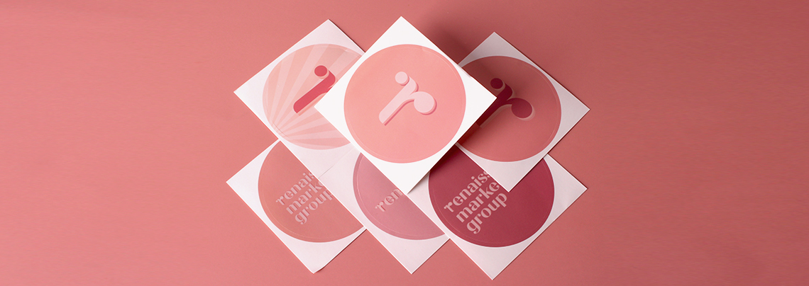
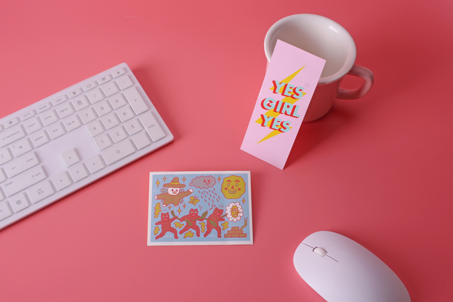
If you’d like to test what you’ve made and see how people respond to your ideas and creations, try printing them on stickers. These cheap stickers can be used to promote yourself and find out what people think about it. Ask for their feedback and see how you can further improve your skills. With how versatile these are, you can easily create something like bumper stickers to boost your renown even more.
Creating a Surprise
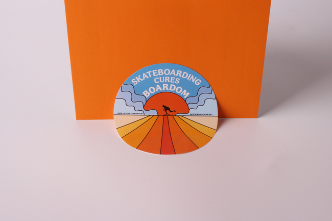
Circumventing expectations is something that many artists do to gain some recognition. Graphic design should be no different. Depending on the kind of advertisement that you’re producing, you can use colors to attract people. Make designs that people don’t expect from your client’s industry, and it’ll surely create some buzz around the brand for a while. If you are holding an event, a colorful poster can be all that you need to spark people’s interest.
To fully take advantage of the surprises, be sure to take complete advantage of the colors you are using. There are multiple guides online that can provide you with great tips. Having the inner know-how is quite beneficial to your goals. Add this together with some great design ideas, and you’ll have more clients in no time.
Adapting to Cultural Differences
While a singular rule is helpful to follow, it is important to keep in mind that colors can mean different things depending on the culture of your target audience. White, for example, symbolizes purity and weddings in many Western cultures. But for some Asian cultures, white can represent death. So, you watch out for certain simple color combinations. Try to find an unconventional color that works well with the colors you are using.
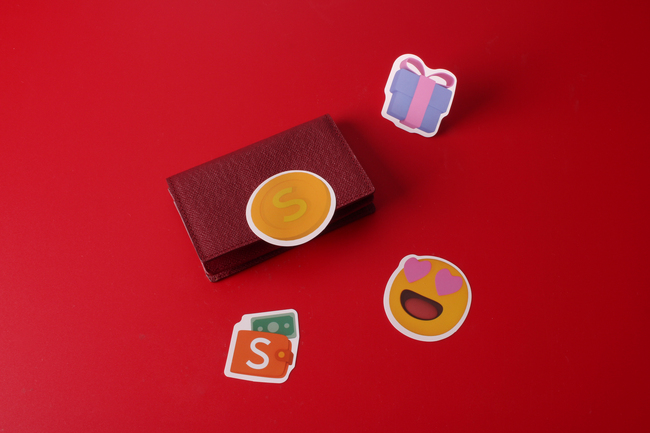
Experimentation is ideal if you can’t use certain colors or do not wish to express certain feelings with those colors. As you are creating a new combination, we recommend printing stickers once again. This is because some colors can look different once they are put on paper. Print out your design on a simple sticker to see if there is anything wrong with the hue or brightness.
Final Thoughts
While it seems like it could be better, there are a host of benefits that come along with breaking the established rules of design and experimenting on your own. But you should make use of this at opportune times. Sticking to the simple basics is still important, and what your clients will want most of the time, they ask you to create something. If you are interested in knowing how long your stickers last, then there are various guides online to help you do so.
