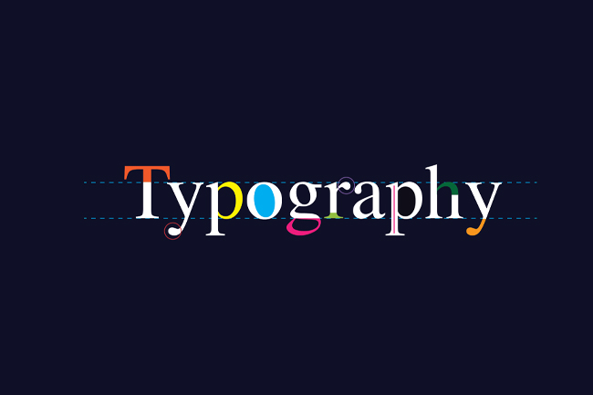
Mastering typography is a challenging feat. Like graphic design as a whole, you’ll need to create something both functional and aesthetically pleasing. Fonts and typefaces can greatly influence the readers. With how important it is, it is necessary that you have all of the information you need to create a pleasant viewing experience for further readers and viewers.
Now, it is expected to commit inevitable mistakes. It’s all part of the learning process. But to save you the trouble of having to learn through experience, we’ve created this blog. We will be focusing on how you can avoid committing simple errors. With this guide, we hope to help you improve your typography skills and inspire you to have better design ideas.
Now, let’s jump right into the guide.
Avoid Incompatible Fonts
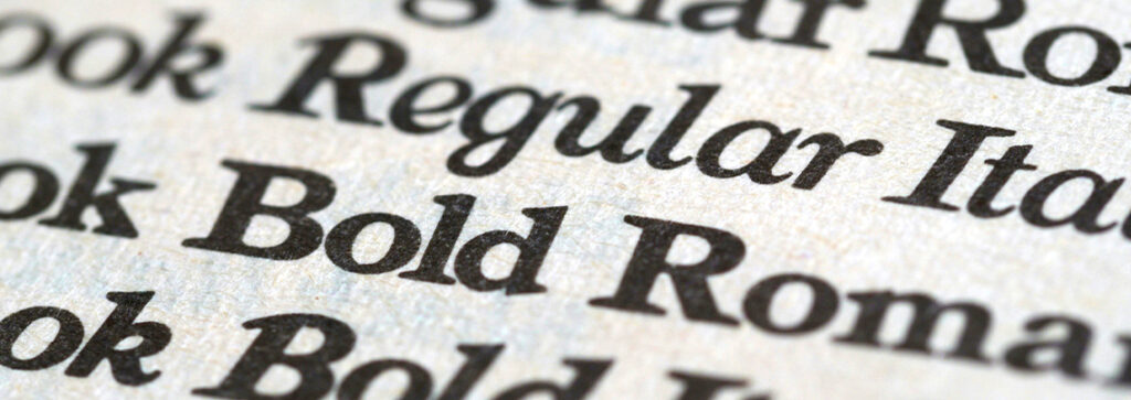
Font selection is crucial for typography. Choosing something that doesn’t agree with your design can cause a lot of issues. That is why it is necessary to find harmony and create balance within your plans. Be sure to avoid fonts that look too similar to each other. Instead, go for something that has different styles and weights. Balance is the most important thing to look for, so make that your focus when looking for a font to put on your designs.
Another thing that we recommend is checking how the print will look like. There are times when the design and font you print out look different from the digital one. To keep things confident, print a copy out and see how it looks. Depending on the results, you may revise certain things before you finalize it. Try a variety of printed materials like paper stickers. It is worth trying out these ideas in order to create a better skill set for you in the near future.
Pay Attention to the Visual Hierarchy
When designing something, you’ll need to think about visual hierarchy. This is the arrangement of the text or image, placing the most important in the most prominent spot. Using the font size on a specific section can send the wrong message to readers, not to mention looking rather silly. With proper visual hierarchy implemented, customers will get to the information as soon as possible. Eliminating any distractions can be advantageous. We recommend that you use various methods to find the best style that suits your clients.
Once again, we recommend that you make use of printed materials to see how things will look in a different medium. If the client wants to make use of promotional stickers, you should know how to make it so that it fits with what the client wants. You should also see if the visual hierarchy changes along with the format. The smaller medium can make things look disproportionate, so make sure that everything looks in order.
Colours Matter, A Lot
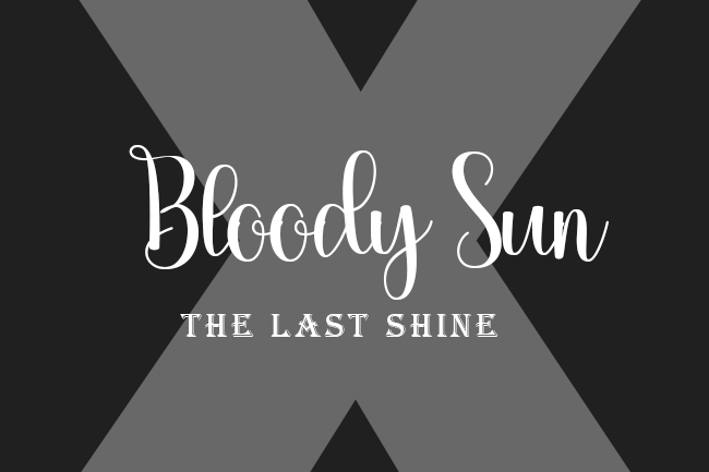
The colours that you use can make or break your design’s typography. If you choose a darker colour, then your text might not become visible to the viewers and readers. You should carefully consider how the text will look with the colours you’ve chosen, ensuring that they compliment each other. Clashing colours can really ruin your day, so be on the lookout for that when you are in the process of creating. Try experimenting with the colours of your text as well. You may come across a colour combo that sets the trend for the industry.
To find perfect colour combinations, check out different guides online. There are multiple articles that can help you figure out what kind of colours you should be using for your design. Remember, you need something that’s pleasing to the eye. Who can read black text against a navy blue background? Nobody. So, adjust the colour and make things readable.
Final Thoughts
And those are the ways you can avoid common typography mistakes. Of course, there are other mistakes that you should be on the lookout for. The best thing that you can do, along with following this guide, is to learn from your mistakes and adapt to them. This is the primary way that you can avoid future errors from happening. Don’t hesitate to keep trying so that you can improve even further.