

Knowing how to design is not the same as knowing how to design for print. The gap between the two is where most print mistakes live.
For brands, print literacy is the working knowledge of how digital designs translate into physical printed objects. It covers colour, resolution, file setup, and how materials behave. Many digital-first brands lack it. The gap shows up every time an order comes back for corrections or a finished product arrives looking nothing like the screen preview.
What print literacy for brands actually means
Print literacy isn’t about mastering design software. For example, you don’t need to know every difference between Illustrator and Canva or how to set up a bleed in Photoshop. After all, those are just tools. Print literacy goes far beyond knowing how to use them; instead, it is about understanding the physical constraints that shape how a digital file becomes a finished printed product.

A designer with strong print literacy knows the colours on their monitor won’t match what comes off the press, and accounts for that gap before submitting a file. Cutting machine tolerances are built into the artwork from the start, not corrected after the fact. A matte label and a gloss label are not interchangeable aesthetic choices either. Each behaves differently on different surfaces and communicates something different to the person holding the product.
None of this requires a background in print production. It requires an understanding that print is a physical process with physical constraints, and that designing for it is a different discipline from designing for a screen.
Why the digital-first gap exists
Most brand owners and designers working today learned their craft in a digital environment. Screens are the primary medium. Social media, websites, digital advertising, and email are where most brand communications live. The skills that serve those channels are the ones that get developed and refined.
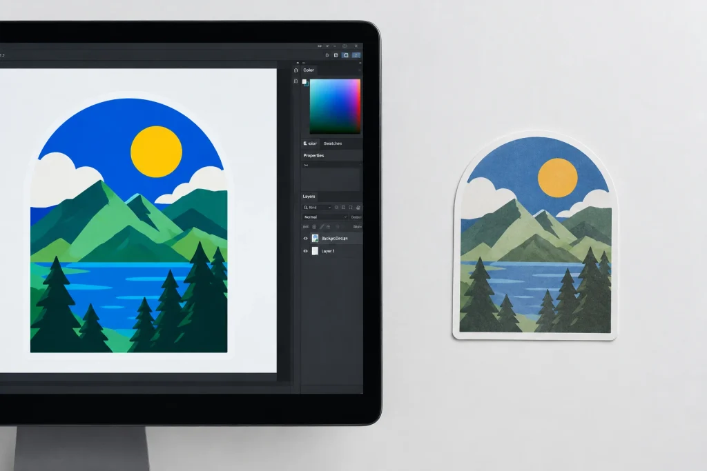
Print sits outside that context. For many brands, it is an output rather than a native medium: something that happens at the end of a process designed and approved entirely on screen. The assumptions that work in digital do not transfer to print without translation. RGB colour, which is how screens display colour, does not map cleanly to CMYK, which is how printers output it. Screen designs are built around pixels, while print depends on physical dimensions and image resolution at the final print size. A design that looks sharp on screen can still contain raster artwork that is too low-resolution for print.
These are not obscure technical details. They are the basic operating conditions of print. Most digital-first brands encounter them for the first time when an order comes back for corrections or a finished product arrives looking wrong.
Why print literacy for brands matters now
When every brand has a website, a social presence, and a digital advertising strategy, the physical objects a brand puts into the world become one of the few remaining points of genuine differentiation.

A product label, a sticker on a package, a branded seal on a gift box: these are the moments when a brand exists as a physical object in someone’s hands. They are also the moments that are hardest to fake. A well-executed physical touchpoint communicates care and competence that digital brand communications rarely can. A poorly executed one does the opposite with equal clarity. A label with a white hairline edge, a colour that shifted between screen and print, a finish that contradicts the product it is dressing: customers notice all of it, even when they cannot name what is wrong.
For brands investing in physical communications, print literacy is what separates a result that reinforces the brand from one that undermines it. It is also what separates a smooth print order from a revision cycle that delays production and adds cost.
What print literacy looks like in practice
In a sticker and label context, print literacy shows up in four areas.
File setup is the most visible. A print-literate brand knows to extend background colours beyond the cut line, keep important design elements away from the edge, and supply artwork in the correct colour mode. These are simple accommodations for the realities of printing and cutting. Getting them right is often the difference between a file that goes straight to production and one that stalls in a correction cycle.
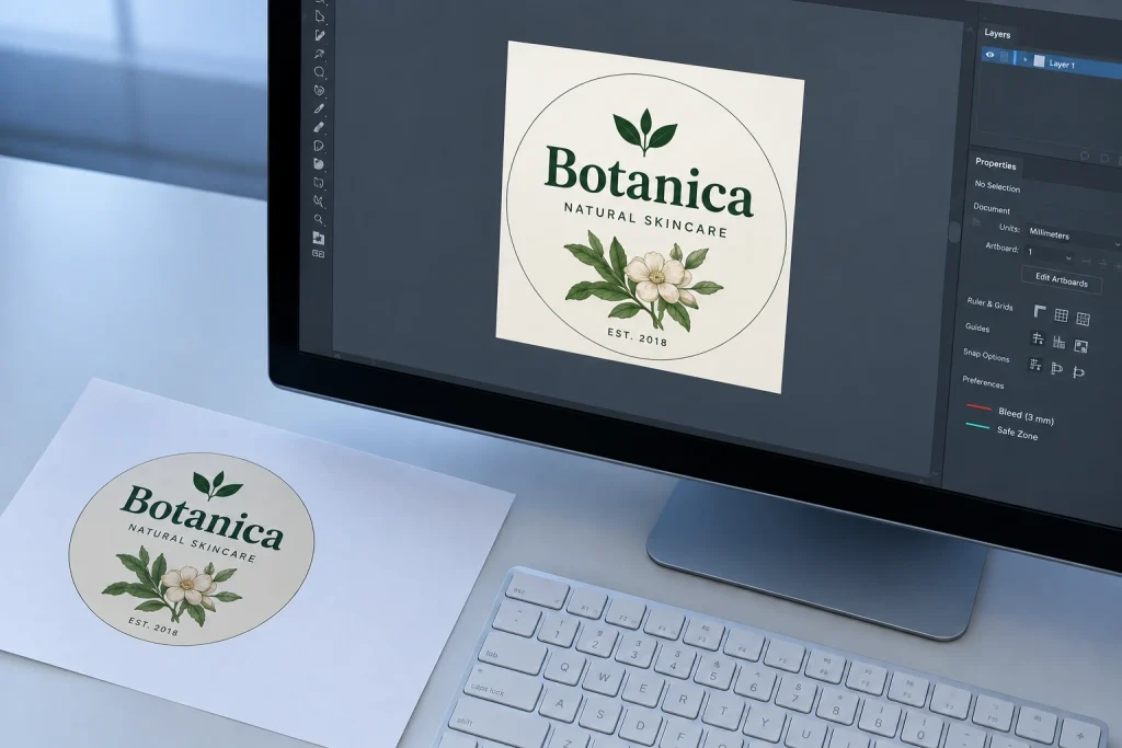
Colour knowledge is the second area. CMYK and RGB produce different colour ranges. Some colours that appear vivid on screen are not reproducible in print without shifting. Certain bright blues, greens, and purples will behave differently off the press than they do on a monitor.
Resolution awareness is the third. Raster artwork should be supplied at a minimum of 300 DPI at the final print size. A file built at screen resolution and scaled up for print will output soft and blurry, regardless of how well everything else is set up.
Material and finish knowledge is the fourth and most often overlooked. Different substrates and finishes behave differently in real-world conditions. An uncoated paper sticker is not suited to outdoor use. A transparent label requires a design that accounts for whatever sits behind it. Knowing which material fits which application often determines whether the finished product performs as intended.
How brands build it without a print production background
Print literacy is cumulative. It builds through experience, and one of the fastest ways to develop it is to work with a printer who explains why a file needs correction rather than simply returning it with a list of changes.
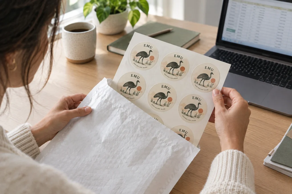
Beyond that, ordering sample runs before committing to quantity is one of the most practical steps a brand can take. A sample run shows how a design actually behaves in print. Seeing a colour shift, or understanding what a 1mm bleed difference looks like in hand, tends to stick in a way that reading about it never quite does.
For Australian brands at the beginning of that process, working with a printer that reviews files before production and issues proofs for approval makes that learning loop even more valuable. Each correction is a reason, and each approved proof is a reference point for the next order.
Final Thoughts
Print literacy is not a specialist skill reserved for production designers or print buyers. It is working knowledge that any brand producing physical communications can and should develop. It pays back in every order that goes to production without a revision cycle and every product that arrives looking exactly as intended.
For Australian brands printing stickers and labels, OzStickerPrinting reviews every file and provides a proof for approval before production. Need help setting up your artwork? The Sticker Bleed, Safe Zone and Trim Guide walks you through the process in Canva, Illustrator and Photoshop.
Most brands learn the most from seeing their artwork in print. Get the first order right, and the next one becomes that much easier.

