

Of all the places a coffee shop’s design has to live, the takeaway cup is the one that travels farthest and forgives the least. It leaves the counter within minutes and spends the next hour in public: on a train, at a desk, in a hand crossing a busy street. It gets seen by people who have never set foot in the shop. No other surface in the cafe works this hard for the brand, and none makes the design work harder to earn it.
That is the tension worth respecting before you open the artwork. The cup is a small, curved, moving, wet canvas, and each of those four words is a constraint that quietly breaks logos built for flat paper. A mark that ignores any one of them arrives looking like a compromise. Get all four right and every order becomes a small advertisement that walks itself around the neighborhood.
The curve: where flat artwork goes to distort
Designers draw logos flat. Cups are not flat. The moment your artwork wraps around a cylinder, geometry starts working against you.
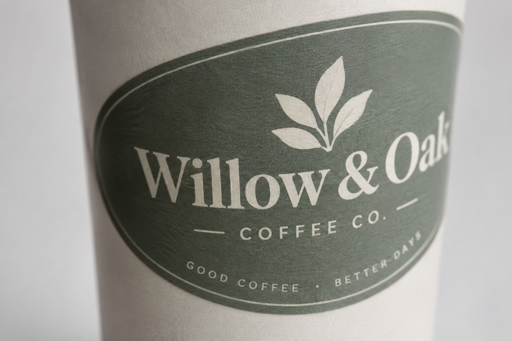
Straight horizontal lines appear to bow. The curve compresses and foreshortens anything wide, pulling the left and right edges of a broad logo toward the back of the cup and out of sight. Then there is the grip: the hand covers the lower third of most cups, hiding whatever you place there for most of the cup’s public life.
The practical response is to design for the front face, not the full wrap. Treat the readable area as a roughly centered panel, narrower than you would expect, and build the mark to sit comfortably inside it. Vertically compact, centered compositions hold up far better than wide horizontal lockups, because they keep the important elements away from the curve’s vanishing edges. If your logo only exists as a wide horizontal signature, the cup is the surface that will finally force you to design the stacked version you have been putting off.
The scale: where coffee cup design loses its detail
A cup gives you a fraction of the space a page does, and small scale is unsentimental about detail. Hairline strokes fill in. Thin type loses its counters. Intricate illustrations that look crisp at screen size collapse into a smudge at cup size, especially once printing spreads the ink across a slightly absorbent surface.
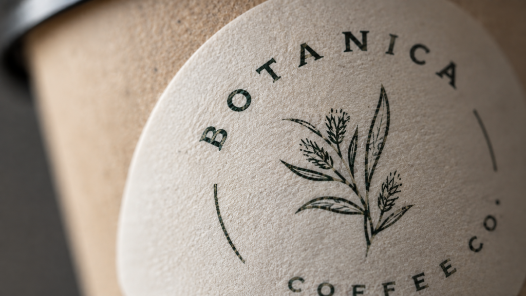
The discipline here is subtraction. Decide what single element has to survive, protect it, and let the rest go. Weight and contrast carry a small mark; delicacy does not. This is also where a restrained color approach pays off. A confident one- or two-color design reads cleanly and prints consistently at size, while a photographic, many-color logo asks the process to hold detail it cannot reliably hold on a curved, moving object. On a clear cup, a single well-chosen color often does more than a full-color version ever could.
The glance: you are designing for motion, not a mood board
On your screen, the logo holds still, and you can study it for as long as you like. Out in the world, no one gets that chance. The cup is always moving: carried by someone walking, caught for a second across a counter, half-noticed on a passing table. Your design gets a glance, and then it is gone.

That changes the goal. The mark does not need to reveal a clever detail up close. It needs to resolve instantly, at a distance, in a blur. Silhouette matters more than finesse. Boldness beats subtlety. A strong, simple form reads from across a room. A beautiful, intricate one only rewards the person holding it. Squint at your design from across your own desk. If it survives that, it will survive the sidewalk.
The wet: where coffee cup design lives or dies
Everything above is craft. This last one is production, and it is where good design goes to waste if it is ignored. Cold drinks sweat. Hot drinks steam and warm the wall of the cup. A hand grips it the entire way. A label not built for that environment lifts at the edges, smears, or fades before the cup reaches its destination, and a peeling logo says something about a brand that no amount of design can undo.
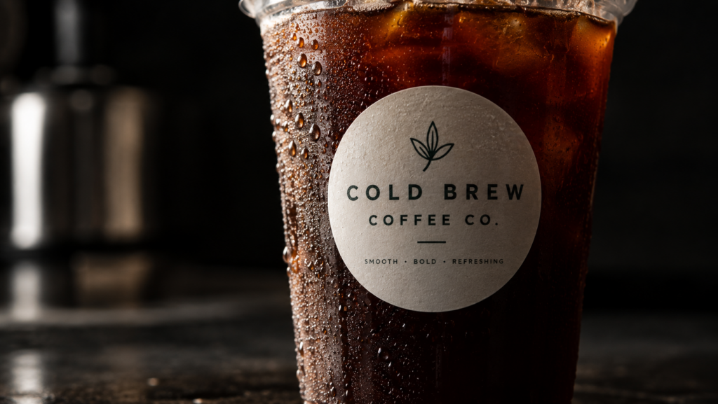
For cup work, waterproof vinyl is the baseline rather than the upgrade. It holds its adhesion and its color through condensation and handling, so the logo that left the counter is the logo that arrives at the office. On clear cups, transparent vinyl gives the clean, no-label look of a design printed straight onto the surface, which suits the minimal aesthetic a lot of specialty shops are after. The material decision is not separate from the design decision. It is the thing that determines whether the design is ever actually seen.
At AllStickerPrinting, this is the conversation we have most often with cafe owners. The artwork is usually the easy part. The material and the surface are where a cup label quietly succeeds or fails.
Final Thoughts
A takeaway cup may be one of the most visible pieces of a coffee shop’s branding. It leaves the shop with the customer, travels through the neighbourhood, and gets seen long after the coffee has been handed over. That makes it more than something to drink from. It is a small, moving piece of the brand, and it deserves to be designed with the same care as any other customer-facing touchpoint.
If you are working on cup labels for a cafe, AllStickerPrinting prints waterproof and transparent vinyl for exactly these conditions. You handle the design. We handle the material that survives the commute. See how cup labels fit into the bigger picture in our guide to custom stickers for coffee shops.