
Bleed in print is one of those requirements that most designers either follow without thinking or ignore completely. If you’ve ever sent artwork to a printer, you’ve probably heard the same question.
“Did you include bleed?“
Some include it because the template requires it. Others skip it because their background already reaches the edge of the page. If the artwork is already the correct size, making it larger can seem unnecessary.
The answer has surprisingly little to do with design software and everything to do with how commercial printing actually works.
The Myth of Perfect Cutting
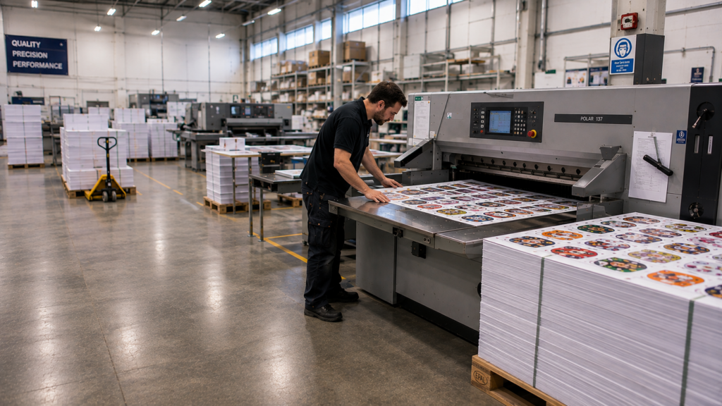
Many people picture the finishing stage of printing as a perfectly repeatable process. A cutting blade comes down, lands in the same position every time, and every printed piece comes out identical.
Commercial production doesn’t work that way.
Unlike a desktop cutting machine producing a handful of pieces, commercial print runs involve thousands of sheets moving through multiple stages of printing, handling, stacking, and finishing. Throughout that journey, tiny variations naturally occur. Paper expands and contracts with environmental conditions, materials shift ever so slightly as they move through equipment, and every machine operates within engineered tolerances.
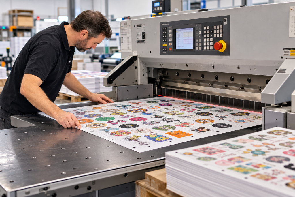
None of this is a sign of poor workmanship. It’s simply the reality of manufacturing.
The same principle exists across countless industries. Good manufacturing accounts for small, unavoidable variations instead of assuming perfect conditions. Printing is no exception.
Bleed exists because commercial printing is a physical manufacturing process, not a digital one.
Why Bleed in Print Isn’t About Bad Printers
One of the most common misconceptions about bleed in print is that it’s there to compensate for inaccurate equipment.
In reality, even the most advanced finishing systems are designed with tolerances in mind. High-end commercial guillotines and automated cutting equipment deliver remarkable precision, but they’re still cutting physical materials that have moved through an equally physical production process.
Bleed isn’t compensating for poor equipment. It’s part of designing for manufacturability.
That distinction matters because it changes how designers and printers think about bleed. It’s not insurance against mistakes. Commercial printers build bleed into the production process from the start.
Think about structural engineering. Engineers don’t design bridges assuming there will never be wind. They anticipate natural forces and build accordingly. Printers prepare artwork with the same philosophy. They don’t expect every cut to land in a different place, but they recognise that tiny variations are an inevitable part of manufacturing.
Why Designers Skip Bleed in Print
If bleed has been standard practice in commercial printing for decades, why is it still one of the most overlooked parts of preparing artwork?
Much of it comes down to how design has evolved.
Today’s designers spend far more time creating digital content than printed material. Websites, social media graphics, presentations, and digital advertisements all exist in environments where nothing is physically trimmed. What you export is exactly what your audience sees.
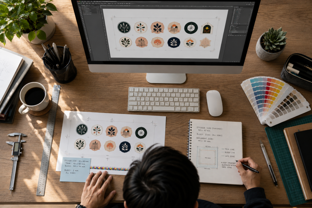
That naturally creates a screen-first mindset.
The popularity of beginner-friendly design platforms has reinforced the same habit. Many designers have never worked alongside a commercial print production team or seen what happens after artwork leaves the computer. Exporting the file feels like the final step because, in many digital workflows, it is.
Screens also create an illusion of absolute precision. Pixels never shift because there’s no finishing stage. Printed products, on the other hand, still have to move through presses, finishing equipment, and trimming before they become the final product.
The White Edge Problem
The effects of skipping bleed usually don’t appear until the very end of production.
Imagine a background colour or image that stops exactly at the trim line. If the final cut shifts outward by even the slightest amount, a thin white sliver of the underlying material can become visible along the edge. It’s only a fraction of a millimetre, but it’s often the first thing people notice.
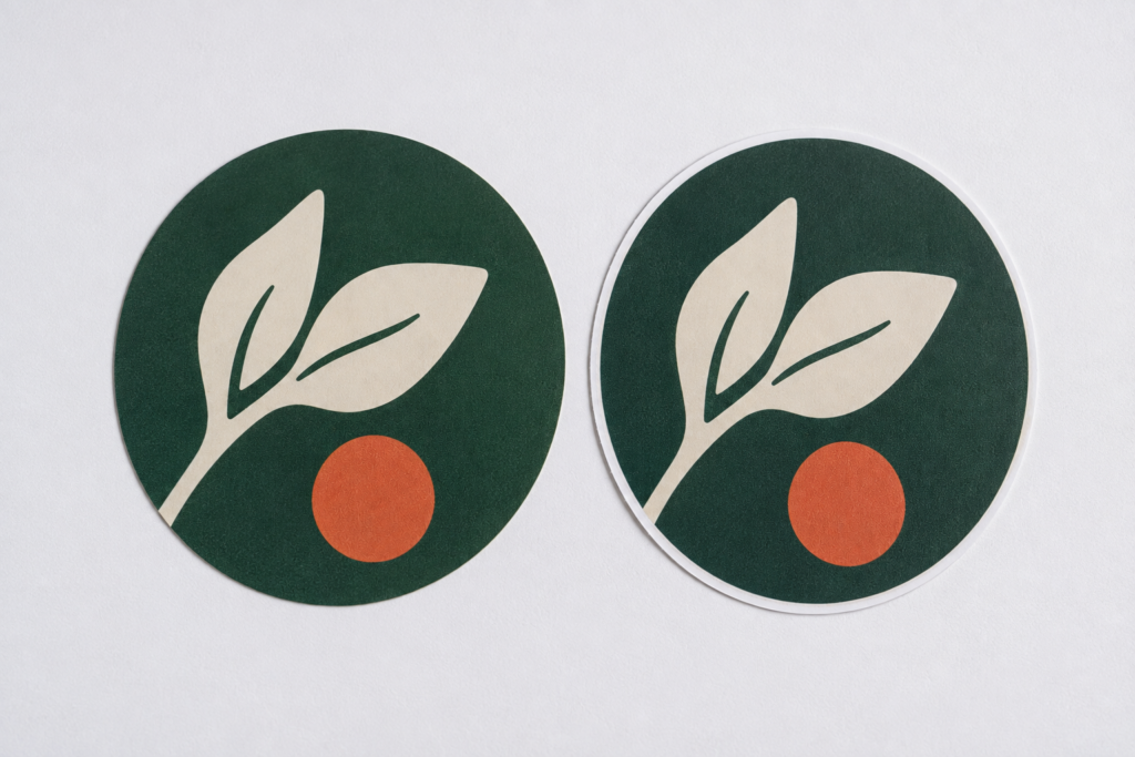
The opposite situation can be just as problematic. Place text or a logo too close to the trim line, and a slight inward movement during finishing can leave it looking cramped or even clip part of the design.
Bleed in print protects the outside of the artwork, while safe margins protect everything inside it.
Why Border Designs Reveal Everything
Some designs naturally disguise small trimming variations.
Photographs, illustrations, textured backgrounds, and edge-to-edge colour rarely draw attention to tiny shifts because there isn’t a clear visual reference around the perimeter.
Borders change that immediately.
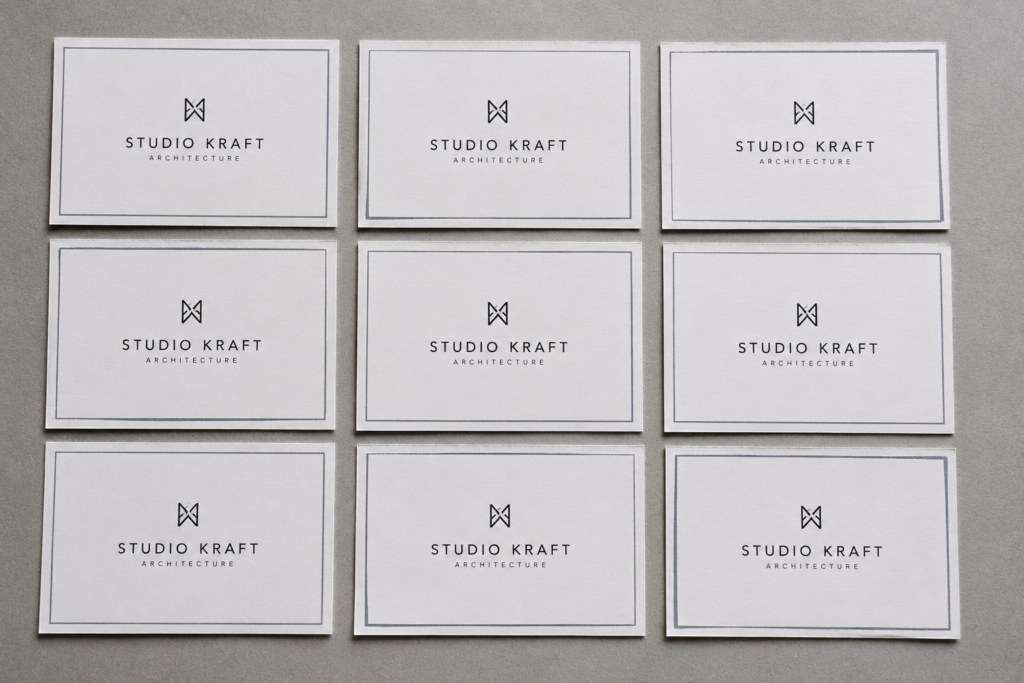
A thin frame around the edge creates a benchmark that the eye instinctively measures against. Even the smallest movement can make one side appear thicker than another, turning an otherwise insignificant variation into something that looks obvious.
The border hasn’t created the movement. It has simply made it visible.
That’s why printers are often cautious about border-heavy artwork. Designs without borders tend to be far more forgiving during finishing, while framed layouts expose every tiny variation.
The Bleed in Print Standard Nobody Notices
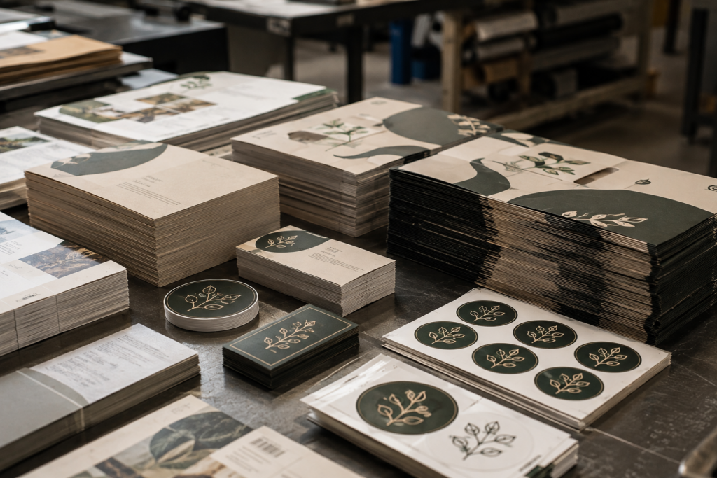
From packaging and books to magazines, labels, business cards, posters, brochures, and custom stickers, bleed is simply part of commercial printing.
Most consumers never realise it exists.
By the time a printed product reaches someone’s hands, the bleed has already been trimmed away during finishing. It has quietly done its job, leaving behind clean edges that look intentional and professionally produced.
When everything goes right, nobody even knows it was there.
Bleed Is Really About Predictability
It’s easy to think of bleed as just another technical requirement buried in a printer’s artwork specifications.
In reality, it represents something much bigger.
Commercial printing isn’t built around the expectation of failure. It’s built around predictable manufacturing. Every stage of production acknowledges that physical materials behave differently from digital ones, and that small variations are simply part of the process.
Bleed in print isn’t there because printers expect mistakes. It’s there because good manufacturing anticipates small variations before they become visible problems.
That’s what separates artwork that merely looks good on screen from artwork that’s designed to perform in production.
Final Thoughts
Bleed is one of those production requirements that’s almost invisible when everything goes right. It’s trimmed away during finishing, never seen by the customer, and rarely thought about once the job is complete.
Yet its role is fundamental. It reflects an understanding that commercial printing is a manufacturing process, not a digital one. The best print files aren’t designed for perfect conditions. They’re designed to deliver consistent results under real production conditions.
That’s why printers keep asking for bleed. Not because they expect something to go wrong, but because good production has always been about planning for what naturally happens.
If you’re preparing artwork for sticker printing and want a practical walkthrough of bleed, colour mode, resolution, file formats, and other print-ready requirements, the StickerMarket Artwork Guide covers everything you need before uploading your design.