

Why the most overlooked decision in print is the one that changes everything
Gloss became the default print finish the same way Arial became the default font. Not because it’s always the right choice. Because it’s the one nobody has to justify.
When a print order form offers gloss as the first option, most people select it without much deliberation. It looks fine in the preview, it’s familiar, and moving on feels like the sensible thing to do. Brands end up deciding with real creative and brand implications in about three seconds, squeezed between choosing a quantity and entering a delivery address.
This piece isn’t an argument against gloss. Gloss has genuine strengths, and in the right context it’s exactly the right call. The argument is simpler than that: choosing gloss deliberately is a completely different thing from choosing it by default. And most of the time, it’s the latter.
How gloss became the default print finish
Gloss earned its dominant position for legitimate reasons. The coating enhances colour saturation, making prints appear more vivid and impactful than they would on an uncoated surface. For product packaging competing for attention on a retail shelf, that vibrancy is a real advantage. For promotional materials designed to catch the eye at an event or in a window display, the added reflectivity helps. Gloss also adds a layer of surface protection that extends a sticker or label’s life against moisture and light handling. For outdoor applications or products that people handle frequently, durability plays an important role.
Those are genuine strengths. These benefits matter most in specific contexts, but brands often choose the finish for applications beyond those contexts simply out of habit. A kraft-effect packaging label on an artisan food product covered in gloss. A soft, considered skincare brand with a high-shine sticker that undercuts everything the design is trying to communicate. A handmade product that arrives looking like it came from a supermarket shelf. These aren’t failures of design. They’re failures of finish, and they happen because gloss was the default, not the decision.

What matte actually communicates
People often see matte as the premium alternative to gloss, and while that view isn’t wrong, it overlooks what matte actually does.
The absence of a reflective coating means light diffuses across the surface rather than bouncing off it. The result is a sticker or label that reads consistently across different lighting conditions, without glare, without hotspots, and without the distraction of reflectivity. In environments where a product is handled, examined closely, or displayed under direct light, that consistency is a quiet but significant advantage.
In brand perception terms, matte communicates restraint. It signals that the brand chose not to shout. That signal lands differently depending on the category: in premium beauty, spirits, or home goods, restraint reads as confidence. In independent retail or direct-to-consumer brands where the relationship with the customer is built on authenticity rather than spectacle, matte often feels more honest. It tells customers that the brand doesn’t need flashy packaging to make its product stand out.
Matte isn’t gloss without the shine. It’s a different register entirely, and the brands that use it well tend to have chosen it because it fits something true about what they’re trying to communicate, not because they wanted to try something different.
The uncoated option most brands never consider
Uncoated sits apart from both gloss and matte in a way that makes it difficult to describe without touching it. There’s no laminate coating at all: the surface is the substrate itself, with all the texture and tactile quality that implies.

For certain brand languages, that texture is the point. A hand-finished label on a jar of preserves. A thank-you sticker on a parcel from an independent maker. Packaging for a product that leads with its craft credentials. In these contexts, an uncoated finish carries the brand message through the material itself rather than relying entirely on the design to do the work. The roughness, the slight absorbency, the way it takes a handwritten note without smearing: these aren’t limitations. They’re features, if the brand has earned the right to use them.
Most brands never get to that consideration because uncoated doesn’t appear at the top of the options list and doesn’t have the cultural familiarity of gloss or the aspirational associations of matte. It’s the finish that rewards brands who know exactly what they’re doing and goes unnoticed by everyone else.
Print finish belongs in the creative brief, not the order form
Most brands choose their sticker finish at the wrong point: on the order form, after they’ve finalised the design.
Print finish interacts with colour in ways that can meaningfully change how a design reads. A palette built around muted, earthy tones will behave differently under gloss than it was intended to. A bold, high-contrast design with strong typography might carry a matte finish well or might lose some of the impact that gloss would have preserved. These interactions are predictable if you think about them at the design stage. They’re surprises if you don’t.
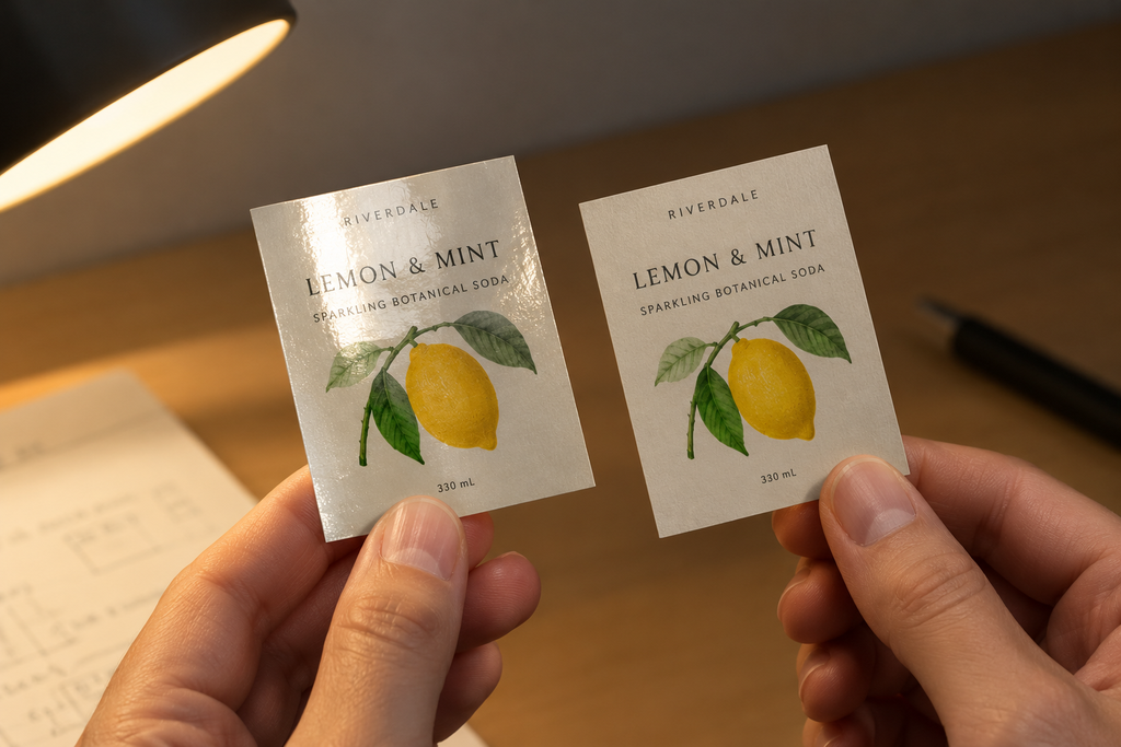
The finish also affects how a sticker or label looks on its application surface, how it appears under different lighting, and how the product feels when someone picks it up. A gloss label on a dark glass bottle under warm retail lighting behaves very differently from the same label on a white cardboard box in a home setting. It only becomes apparent when finish is treated as a design decision rather than a production variable.
Printers that make finish options genuinely visible and comparable before you commit to an order make this easier. StickerMarket presents finish choices against specific products with enough clarity that you can decide at the right stage, with the right information, rather than selecting a default because the form needed an answer.
Final thoughts
Gloss will always have its place. For certain products, certain contexts, and certain brand languages, it’s the right finish and the deliberate choice is to select it. The issue isn’t with gloss; it’s with the absence of deliberation.
The brands with the most coherent physical identity are the ones where every detail was chosen rather than assumed. The typeface, the colour, the material, the shape, and the finish: each one either reinforces the brand or quietly works against it, and the difference between the two is usually whether someone thought about it at the right moment.
Print finish is a creative decision. It deserves to be made like one.