There is nothing that people value more than their time. As such, reading materials need to be concise and informative. An article by Forbes shows us why too much information can be such a negative thing. Now, you might be wondering, “What does this have to do with design?” and the answer is relatively simple: Graphic design seeks to provide the viewer with information. This information could be for both marketing and non-marketing uses.
When designing something, the goal is usually to show people certain information and draw them in. This is where visual hierarchy comes in. You will need to know which piece of information goes where and how to present them. As the name implies, there is a hierarchy of things defining the importance of each element. Mastering this will allow you to communicate with people effectively without your designs causing any confusion.
In the blog today, we’ll be talking about how proper use of visual hierarchy can improve your different designs.
Here are the things you need to know:
Explaining Visual Hierarchy
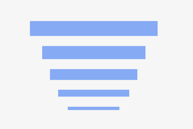
Human beings often look for symmetry and order. Visual hierarchy plays on this habit by arranging elements on a website or design in the order of importance or how you wish them to view it. As a graphic designer, you’ll want the viewers to easily understand the content or information you share.
By properly using the layout, you’ll influence how the viewer perceives and understands information. A great designer knows how to strategically attract the viewer’s eyes and attention to the entire composition and lead them through the different levels of priority and flow of information.
Essentially, this element of design implements an understanding of how the human brain perceives visual information and the influence of those visuals on cognition.
Reading Patterns
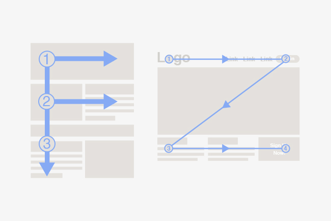
The most common writing system teaches you to read from top-down and from left to right. Understanding how reading patterns lets you know how a person becomes interested in the piece from committing their attention to it. There are two shape patterns that people use to scan what they’re looking at.
First is the F-pattern. This applies to traditional pages that are heavy with text like articles and posts. A reader typically scans down the left side of the page, trying to find keywords that’ll interest them. The reader will then stop reading when they see something interesting — the reading path results in the F pattern ( or E). You can use this by aligning the vital information you have on the left side. We also suggest you use short headlines and other tactics to grab the people’s attention quickly.
The second type of pattern is known as the Z-patterns. This one applies to other pages, such as website pages and ads. Because information isn’t in a paragraph block, the reader begins by scanning the top of the page and then goes to the opposite corner in a diagonal pattern. Once they reach the bottom, they do the same thing across the lower part of the page. Web designers often construct pages to conform to this behavior.
With a bit of creativity, you can apply both of these patterns on traditional printed materials as well. Things like business cards will benefit from proper application.
Common Tips
When it comes to implementing this concept, it can be difficult if you don’t know where you can begin. Here are simple tips that you can follow to help you get a better grasp of it:
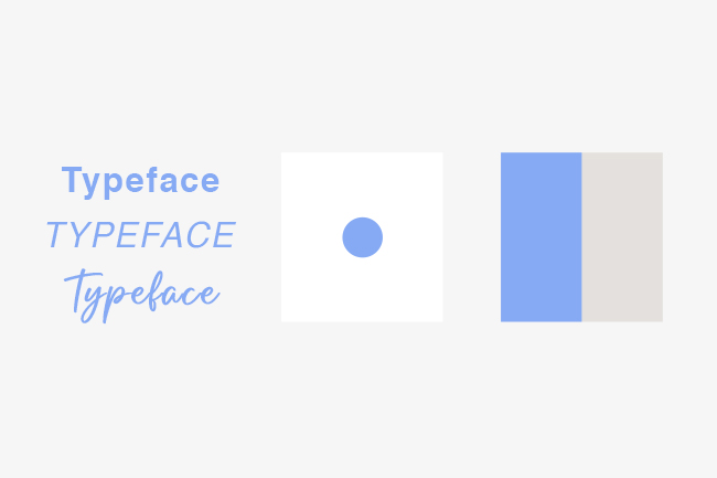
- Typeface: The first thing you need to use to establish the visual hierarchy is settling on a correct typeface. Weight is the most essential attribute as it affects the width of its letters. You’ll want to use more prominent, bolder styles to emphasize your desired information. Adding other modifications like italicization is also a solid option. This produces a dynamic and unique look.
- Whitespace: Whitespace or empty space may seem rather simple, but it’s got an important role to play. Utilizing it properly helps make the info you’re trying to emphasize really pop and stand out. Think of the whitespace as an essential support character, always there to lend you a hand without getting any of the credit.
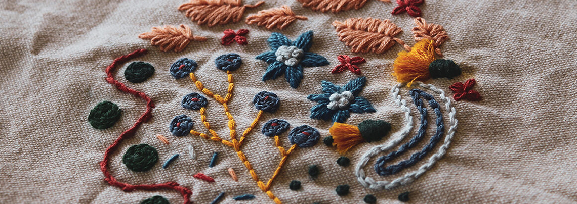
- Color Contrast: Now, this one may be a no-brainer. Creating contrast in your colors allows you to highlight certain parts of your design, bringing people’s attention to it. You can combine yellow and black, making the darker color stand out even more. This one is rather versatile, as it’s applicable on several mediums like custom stickers and brochures.
Final Thoughts
Following the guide will help you improve your designs and make it easier for you to communicate with viewers. You can use this to make people notice the vital information you have. It is quicker for them to skim the content and save them more time. Making things simpler for people allows for quicker decision-making. With enough skills, it’ll be easier to spot the difference between professional and amateur work.
Read related article: 4 Fundamental Graphic Design Skills To Have