When building a small business, first impression is everything.
Every touchpoint, from website to packaging and business signage, shapes how people perceive your brand.
Colour is one of your branding toolbox’s most powerful yet often overlooked tools.
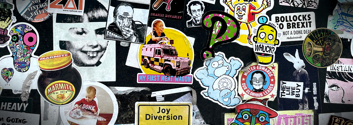
Whether on your product labels, vinyl stickers, or business cards, colours play a crucial role in helping shape your brand identity and personality.
The Psychology of Colour and Its Relevance For Your Stickers
According to a study, around 90% of a customer’s initial impression of a product comes from a colour. Another study reveals that colour increases brand recognition by up to 80%.
Colour isn’t just visually appealing but also evokes emotions and psychological responses. It influences how consumers feel about your brand, whether they will buy, trust, or remember it.
Your brand can make a significant impact with the right custom sticker design and colour choices.
Let’s explore the different colours and what they say. Determine the one that conveys your brand’s story, connects with the audience, and inspires action.
Red: The Colour of Attention and Action
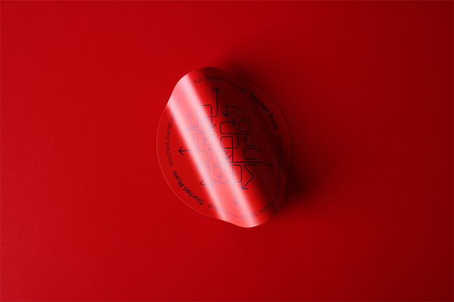
Red colour exudes power, energy, excitement, passion, and fearlessness. It also stimulates, energises, and creates a sense of urgency. This is why retail sales, fast food, and high-energy brands use red.
On the other hand, red can also powerfully foster negative feelings. It represents warnings, anger, defiance, danger, pain, and aggression. Red works best for your brand when used in the right context.
Red is also excellent for brands that want to trigger impulse buys, grab attention, or make bold branding statements.
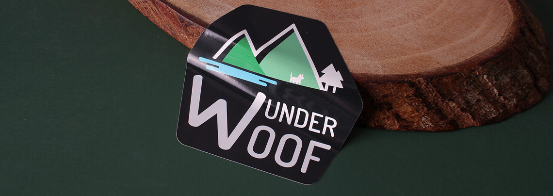
Green: The Colour of Growth and Wellness
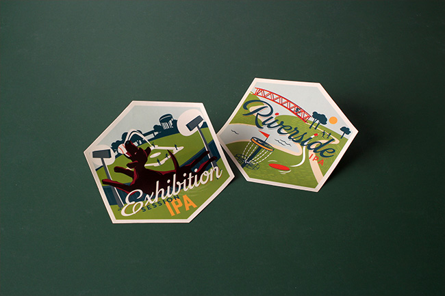
Green is the colour of nature, which is why it’s calming and refreshing. It is also associated with health and sustainability, making it perfect for eco-conscious brands and health and wellness-related products. Psychologically, green evokes feelings of serenity, safety, and renewal.
Using this colour in your branding will depend on the shade you choose to help communicate the message. Why? Because not all greens are the same.
Soft greens: peaceful, calming, soothing
Bright neon greens: energetic, bold, and can feel intense
Dark forest greens: grounded, rich, stable, sometimes more serious
Is this colour perfect for your brand, and what it represents? Whether your brand is about sustainability or health and wellness, ensure that you use the appropriate shades of green when designing a logo sticker.
Yellow: The Colour of Energy and Optimism
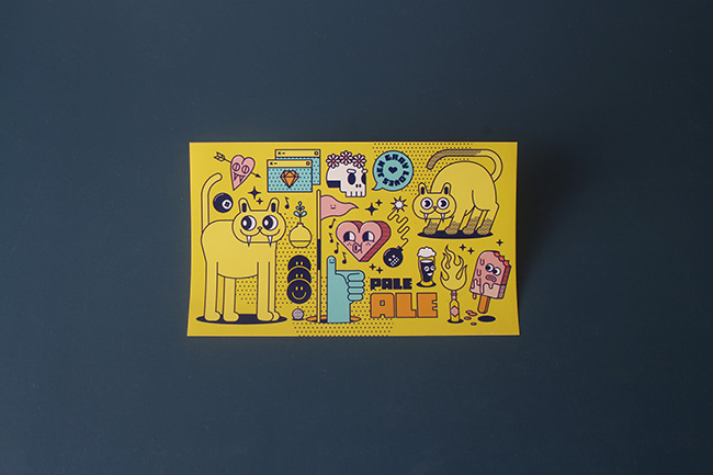
Yellow is friendly and warm, and it grabs attention with a softer, more cheerful vibe. It’s also playful and inviting and represents happiness and youthfulness. Yellow is the colour of sunshine, smiley faces, rubber ducks, and sunflowers.
Does your brand want to tap into positivity, extroversion, warmth, and creativity? This is the right colour choice to convey that message.
But remember, too much yellow can be overwhelming. For the best result, use it as an accent to inject energy without dominating the design.
Blue: The Colour of Trust and Calm
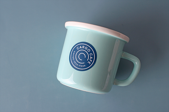
Blue is one of the most trusted colours in branding and the world’s favourite colour. It exudes calmness, dependability, and professionalism. It also brings security, trust, wisdom, and strength.
This is why financial services, tech companies, healthcare, and other industries use this calming tone as part of their branding elements.
Incorporating this colour in your logo perfectly conveys reliability, credibility, and appeal to professional audiences.
Black: The Colour of Luxury, Modernity, and Sophistication
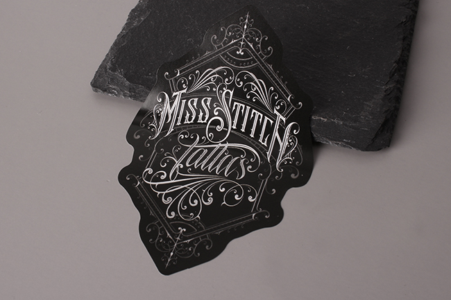
Black is timeless, elegant, sleek, minimalist, and communicates confidence and exclusivity. Leveraging this colour can make your brand powerful and sophisticated. When designing a sticker for your print marketing materials, a simple white or metallic typography can make it look incredibly high-end.
You can pair black with silver or gold vinyl stickers for a more premium look. This can make a bold and elegant impression on your brand.
Final Thoughts: Make Your Design Communicate
When using stickers as part of your marketing tools, remember they aren’t just a decoration. They serve as a miniature billboard of your brand. It is an excellent opportunity to say something — visually, emotionally, and psychologically. When designing the next batch of your stickers, ask yourself these questions:
What emotions do I want to create?
What do I want people to remember about my brand?
Does my branding colour support the message I want to convey and represent?
By using the appropriate colour backed by psychology, you’re not just making stickers to look good. You also build trust, connection, recognition, and practical sticker marketing.
In Case You Missed It: Top 5 Print Marketing Materials to Look For in 2025