You may not know this, but math is everywhere. Yes, math is even in art. The dialogue between the two, from the golden ratio to several architectural designs, the presence and importance of math in art cannot be denied. Of course, this applies to graphic design as well. There are many times when you make use of some math while designing something, like incorporating the golden ratio into it.
Today, we’ll be talking about a guideline that is rather similar to the golden ratio, the rule of thirds. This guideline is useful if you wish to create a beautiful aesthetic for your designs, bringing harmony and balance to it. We’ll discuss the rule of thirds and how you can make use of it when creating something for the first time.
In this blog, we will guide you on this topic and show you all that you need to know.
Let’s jump into it.
Understanding the Rule of Thirds
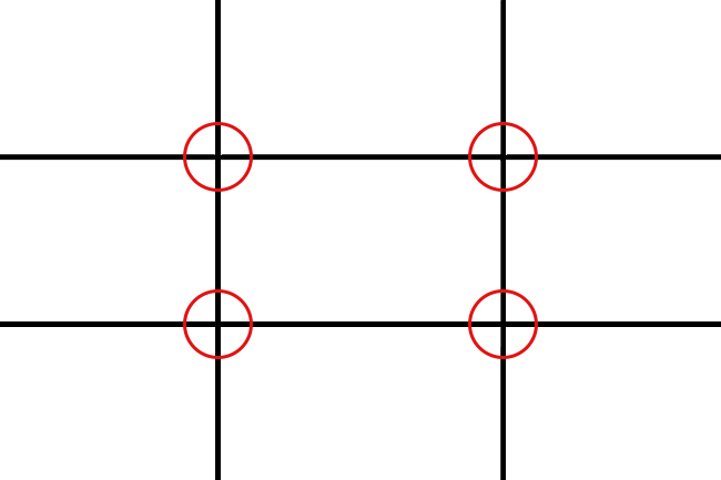
The rule of thirds is a method of dividing the space in a design or photo. It makes use of three columns wide and three rows tall. This grid is what designers use as a guideline, breaking the canvas up for the evenly-spaced columns and rows. It helps you with common issues such as positioning the images, aligning the text, and arranging all the elements to make it easier to digest the information being presented to the viewers.
When you make use of this design, the lines of the grid will come together at four intersections at the center of the image. The human eye naturally focuses on these four points more than any other part of the piece. The asymmetry that is created by using three columns and rows (rather than four) draws people’s attention when they scan an image, making it easier for you to craft pleasing designs.

This can work no matter the shape of the canvas you are using. For example, you are intending to use the design for a custom decal, you can incorporate this without any trouble at all.
How Is It Used?
In the world of design, there are rarely things that can be counted as hard “rules”. This is because art is always something subjective, leaving a lot of room for change and creativity. So, when using the rule of thirds, it is best to think of it as a set of guidelines that you can use instead of a bunch of rules you ought to follow.
As such, you can incorporate the rule of thirds in your design process as much as you like. Of course, the most common way to do so is to use it as a guide in arranging different elements, texts, fonts, icons, and images in a way that is both visually pleasing to the user and helps them interpret your message easier.
The asymmetry of the grid creates designs with a good flow rather than rigid looking-ones if you follow total symmetry.

Breaking the Rules
We’ve mentioned before that, rather than a strict set of rules, the rule of thirds is more of a guideline than anything else. You should not set out to design something with the rule of thirds on your mind. This is because sometimes, you’ll need to break the rules to create something truly unique.
Understanding and mastering the grid gives you more creative freedom. You can use your knowledge to create special and wonderful works. We recommend that you experiment as much as possible to find what works for you.

Final Thoughts
That’s how you can incorporate the rules of thirds in your various designs and pieces. You can enhance your style just by incorporating it. As guidelines you can follow, they allow you to find a new perspective on design.


