In business, making a solid first impression is crucial. Its impact must be recognized. As such, you need to do everything you can to ensure that you are able to make an unforgettable first impression. From the clothes that you wear down to the way you talk, you should look and sound as professional as possible. But, there is another thing that you may have overlooked: Your business card.
With the advent of the digital age, you may think that a business card needs to be updated, but this could be further from the truth. In several industries, many still use one to not only introduce themselves but also to represent their companies. A lot is riding on this little card, so you’ll want to ensure that everything is perfect. But mistakes aren’t unavoidable.
💡 Read more: What makes business cards important?
To help you out, we’ve made a guide that’ll help you know what design choices you should avoid. Let’s go!
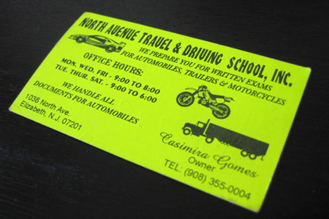
A Bit Too Much Information
The main reason for handing out your business card is to provide the person you’re giving the card to with valuable information. However, this doesn’t mean you should have a card with everything about your company. It would help if you kept it to the bare essentials like your name, socials, contact info, and position. While you want your potential clients to work with you, they will need more time to look through your card for all the information.
The meeting should be scheduled at the right place and time. So you should think of your business card as a way in, something to get the client interested but not overwhelmed. So keep everything as simple as possible. We also recommend that you put only a little information that may compromise sensitive information regarding your own company.
Garish Colors and Font Choices
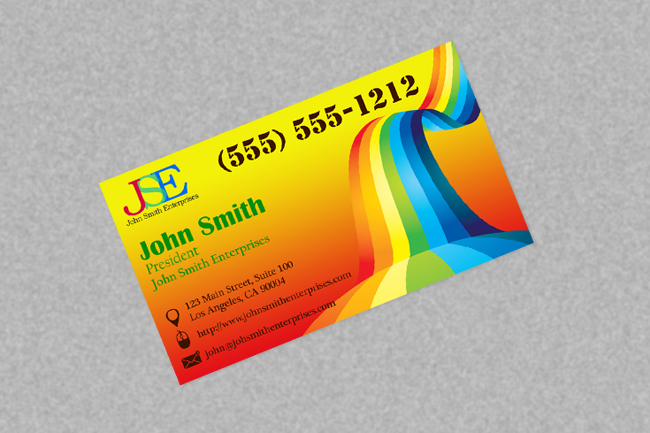
Even when you have a great design, bad colors and font choices could end up ruining the entire look of your card. Once again, we recommend that you keep things clean and simple. Your card should not only represent you but also your company as a whole. Choose the primary company colors and a simple font to make it easy on yourself.
Like adding in too much information, making typography mistakes is common. As long as you know what to avoid, you should be good to go. Remember to keep things clean. You want the text to be easily recognizable and read. Even with a great choice of color, your client can need help with reading the text.
💡 Keep reading: Common Typography Mistakes For You To Avoid
A Bad Print Job
This one may not seem to be that obvious, but trust us, it shows. A bad print job can upend all of the hard work that you’ve done. So as to avoid going through all that trouble, you should look for reliable printers to give you the best business cards possible. We recommend experts who specialize in printing business cards, name cards, calling cards, and more.
Once you’ve found a reliable company, you should try things out first! Do a test print and see what you get. Many will offer the option of printing only a single copy. This should give you all of the info you need. Printing only one copy also reduces the cost you may need to cover should you find the business card to not be up to stuff.
Final Thoughts
That’s it! By paying close attention, you can avoid some of these common mistakes and create the ultimate business card! With the ultimate business card in your possession, you won’t have to rely on making a strong first impression. You may even close a deal even before giving a pitch!
