Learning new skills is one of the most important things in one’s career. Whether you are just a beginner or an industry veteran, understanding all that you can about your craft is imperative. The best way to master your chosen field is by learning the basics and building strong fundamentals from there.
Of course, the world of basic designs is also the foundation of various visual mediums. Although these fundamentals might seem complicated at first, keeping an open mind can take you far. With graphic design being such a competitive field, upskilling is always a must. Even after you learn all that you can about the basics, it will take time, dedication, and further education to truly master the art of graphic design. As Peter Drucker once said, “Learning is a lifelong process”
In our guide today, we will discuss basic graphic design skills that you should know about. These skills will help you get started or build on the things that you already know.
Let’s get started.
Using Colours
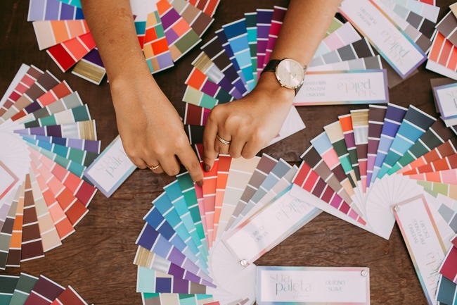
Normally, colours are mainly used for aesthetics. You use what colours you like or what colour matches a certain theme. In graphic design, however, colours are more than that. It is a way for you to communicate with the viewers. Certain colours have an effect on people, evoking feelings and thoughts. You’ll need to take advantage of this in order to help the brand you are working on thrive.
For example, red and yellow are usually used in the food industry because it stimulates feelings of hunger in a person. Other colours have similar uses as well. Different colours produce different results, so make sure that you are choosing the right one to represent your brand and image. Misusing colours can cause confusion among target audiences.
Proper Information Hierarchy
As you are designing your piece, you may wonder about where to place the text, in what order, etc. This is where you should make use of a hierarchy scale. The scale can vary depending on what your client wants you to prioritise. You should make that information stand out from the others. Traditionally, titles will have the largest font size followed by everything else in the design.
Following this method allows you to avoid clutter in your designs. The last thing you need is to have too much information on a single piece. You want the viewers to look at things at a time. Also, the information you wish to highlight should catch the attention of passersby. Mastering this basic skill will make everything you design organised and prevent certain information from getting lost in the shuffle.
Find the Right Image
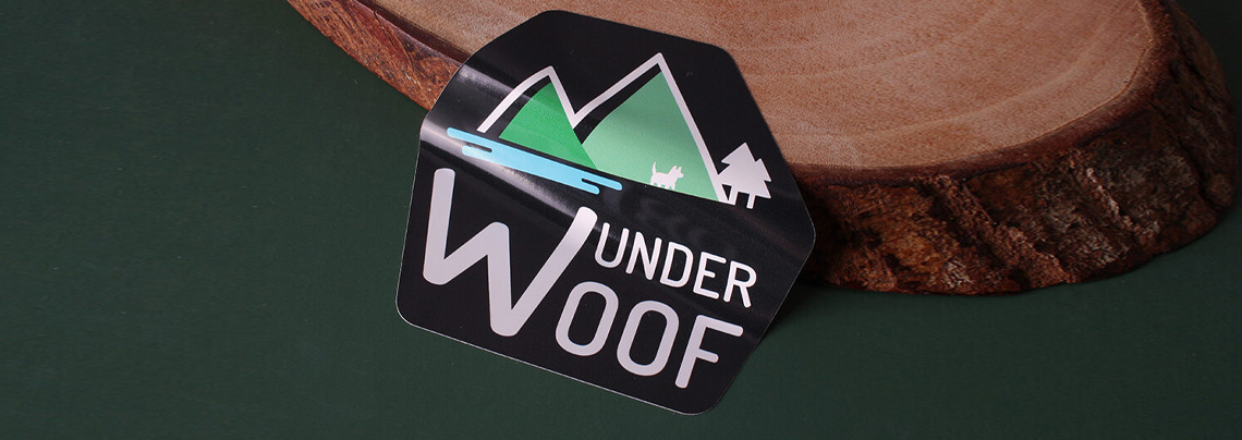
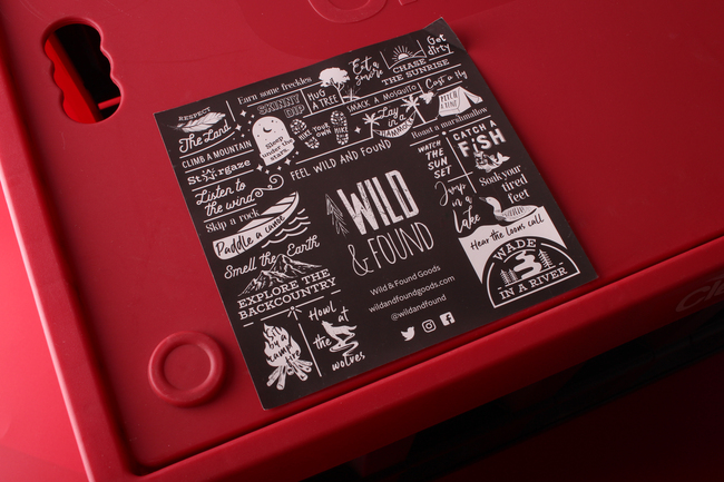
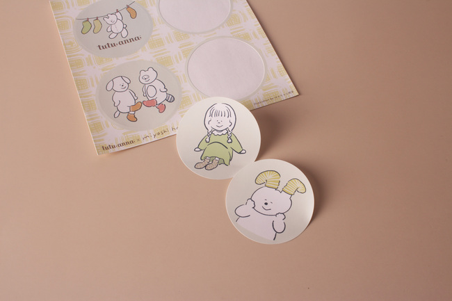
It’s often said that an image can speak a thousand words. In the world of design, choosing the right image to use is paramount. You’ll need to find the most suitable image or else you’ll be sending the wrong message to the people who’ll end up seeing your designs. During marketing campaigns that make use of printed materials like stickers, you might be tasked with using certain photos and editing those to fit the marketing campaign strategies.
Whether it’s illustrations, photographs, or even simple icons, the image that you pick should represent the brand’s visions and ideas in every way. One thing to remember while looking for or using images is copyright. You wouldn’t want to infringe on another brand’s image. Consult with your clients to truly bring their vision to life.
Putting it All Together
Once you’ve got all the basics down, it’s time to use them to create something unique. Branding is when you bring products, businesses, services, and stories to life. If you wish to create a brand that an audience can relate to, you’ll need to follow a solid strategy. For example, you’ll want to commit to a single design during promotional campaigns.
Learning how to adapt your designs to fit branding ideas is essential. Not only is it useful for your business, but for your clients as well. By building a strong brand, you can easily create a powerful reputation in the industry and earn more customers as patrons. For many companies, this step is of the utmost importance. Another thing you can do to improve is learn a bit about the basics of font psychology.
Final Thoughts
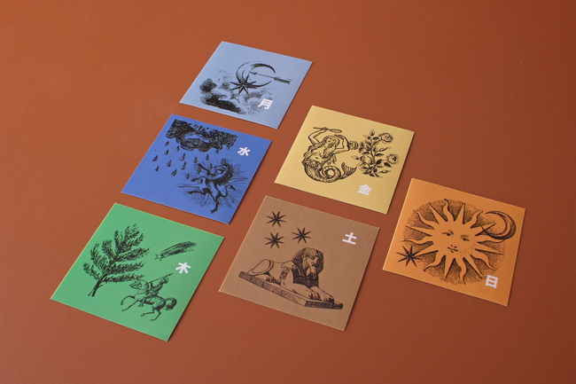
Those are just some of the basics that you should know about. Mastering each one will give you an edge over the rest of the competition. Building up your fundamental skills will open up a lot of opportunities for you to create that the world hasn’t seen before. Even after you’ve mastered advanced skills, you shouldn’t forget to polish each basic skill all over again. Try out something small and create some laptop stickers to test your skills!
