Making your own stickers can be rather complicated. Of course, there are simpler parts of the process, but you really need to plan things out to achieve the best results. If you are just starting out, it can be overwhelming. So it’s important to learn everything that you can from guides, videos, and even classes. Throughout your research, you’ll learn the importance of having well-designed stickers.
Besides the visual appeal, the design has to make sense. This means that you need to send a clear and simple message. To help you create the best possible stickers, we’ve made this guide! In this, we are going to talk about the different things you can do to create a great looking sticker.
Here’s a couple of tips:
Use High-Res Artwork
Now, this first tip may seem incredibly obvious but many people often ignore this part altogether. The difference between low-res and high-res art is night and day. You should always aim to have the image look as clean and crisp as possible. For most printers, 300 DPI is sufficient. A blurry image can not only turn the customer off from buying your product but may get you in trouble as well. It’s best to have labels that are fully legible and understandable.
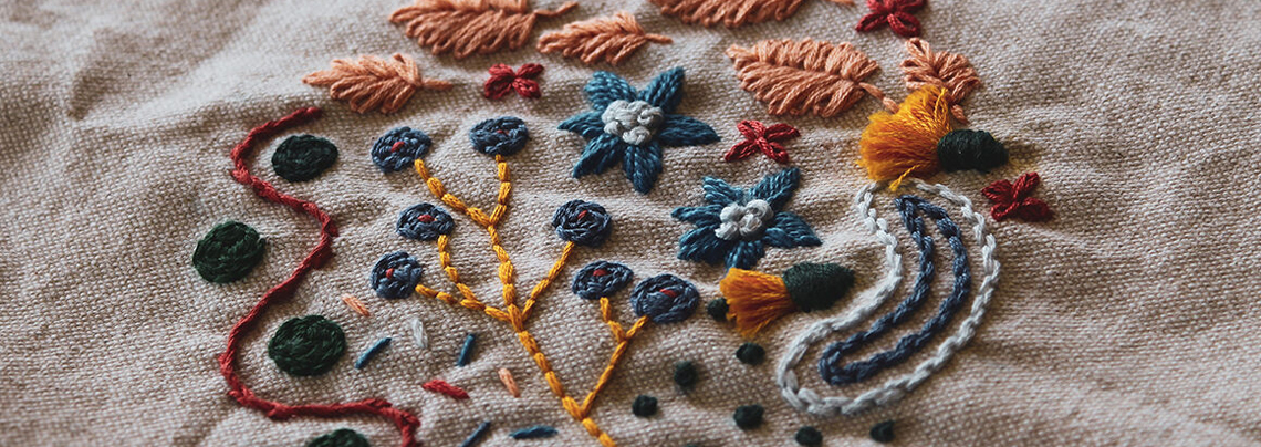
Here’s a tip within a tip: use vector graphics. This can typically be done using software like Adobe Illustrator, creating smooth images without losing their quality. You can use this for several of your designs, like logos, simple text, and more complex designs. The designs will come out much better than before.
More on this blog: Recommended File Formats for Printing

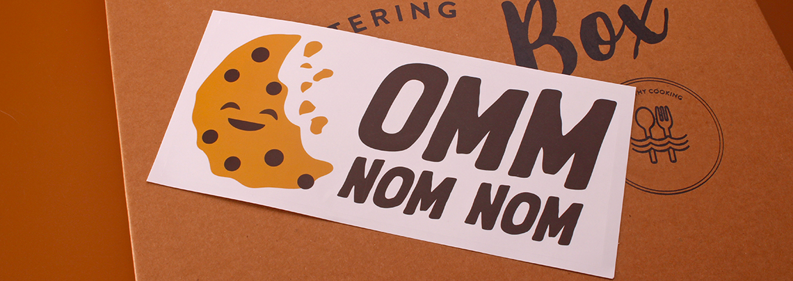
Use Simple Concepts and Ideas
Have you ever heard of the KISS principle? It stands for Keep It Simple, Stupid. As it implies, it suggests keeping designs as simple as possible. This is a fantastic concept to follow if you are creating stickers. As the size of these tools is usually small, it will benefit from simpler design choices. Remember, you only have a few seconds to impress on-lookers. Why waste it on making something they wouldn’t get at a glance?
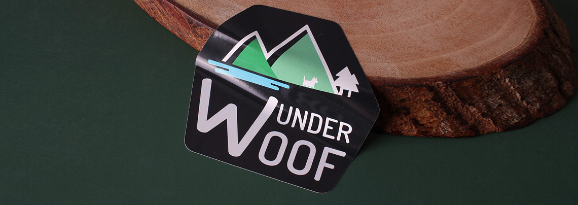
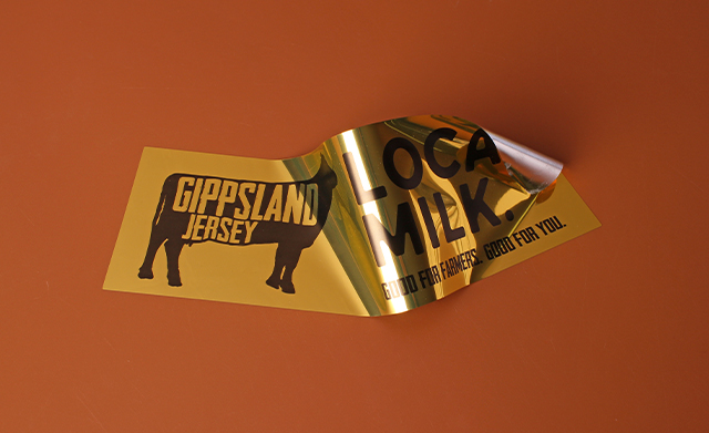
Now, while the design is simple, that doesn’t mean you skip out on making the sticker look special. You can make use of several special materials to further complement your designs. Something like a gold vinyl sticker would stand out even with simplistic designs. Another would be holographic materials. These are enough to draw people’s attention without having to compromise your designs.
Make Proper Use of Typography
As you learn the ins and outs of designing a sticker, you may come across people talking about print typography. If you haven’t, then we’ll give you a brief summary of what it is. Basically, it refers to how fonts look when they are printed. This is important to take note of as the fonts you’ve chosen can be different from the ones on the software.
As we’ve mentioned before, your goal should be as clear as possible. You should keep following the KISS principle as well. Complicated fonts can cause confusion or just look cluttered. Aside from sticking with simple fonts, you should use ones that go together. Making it easier for your customers to read the content will pay off a lot more than you think. Test your prints to see if there are any problems beforehand. You could also check online guides to learn how to promote your design skills!
Final Thoughts
These tips will give you all of the info you need to ensure that your prints are a success! Follow these along with guides online to create the best looking stickers possible. If you are only interested in designing things, that’s fine too! There’s a lot of printing professionals who can help you bring your vision to life.