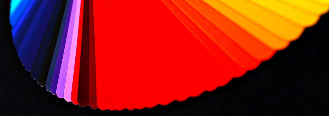
For an artist or designer, working with colours comes as naturally as breathing. However, only some perceive colour the same way. According to Healthline, Achromatopsia (a condition that affects how people perceive colour) affects 1 in 30,000 people worldwide. Of these cases, up to 10% cannot see colour. With how common it is, becoming more inclusive is an important step the industry must take to grow further.
But how do you go about this? How do you cater to colourblind viewers or design something when you are colourblind yourself? Don’t worry. There are a few tricks that you can employ to enhance the quality of your work. There are other skills you should look into learning, such as printing stickers and learning to become a better graphic designer. Now, let’s take those tips.
Here are some things that you should know.
Take Advantage of Colourblind Simulators
To help you know how colourblind people see your work, you should try using a colourblind simulator. There are various apps and features that allow you to do so. With a different perspective, you can see how your design will look. Depending on what you’d like to achieve, you can change it up so that it’ll look great, no matter who sees it. Try using different styles as well while you are doing this.
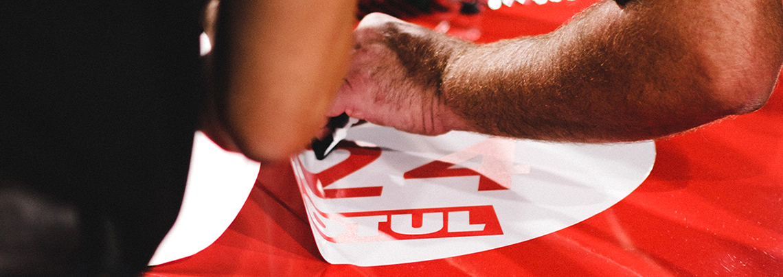
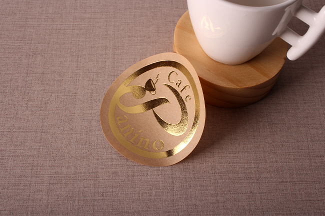
We recommend that you check how the design will look in physical mediums as well. There are times when the art doesn’t translate well to a printed medium. Try printing a car sticker as a test run. Once you’ve seen how it looks in person, add the necessary adjustments before printing out the next version. You should be able to perfect your craft in no time after this.

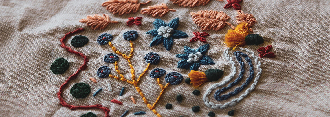
Contrast Is Super Important
Using contrast is a good way for you to distinguish the different elements of your piece without solely relying on colours for guidance. This also gives the colours you choose better readability. Try adjusting things like the brightness and saturation levels instead of letting the designs fade away into the background. Find which one’s best stands out and make use of your skills in the format you have in mind. Mastering these skills not only helps you improve your skills but also cuts down your reliance on colours.
Once again, you’ll want to create proofs by printing your designs on designs such as stickers. You’ll want it to be recognizable, no matter what sort of form it takes. Try using art paper stickers for this. These affordable materials are an excellent option for both single and mass printing. So not only will you be learning and improving your craft, but you’ll get to make a little money out of it as well.
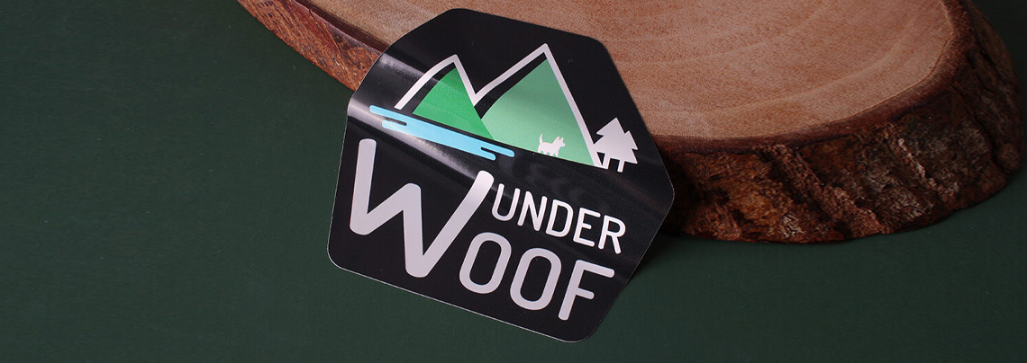
Incorporate More Icons and Text
Another way for you to minimize the prominence of colours in your design is to add icons and text to it. Just like colours, icons, and text are effective at drawing people’s attention and interest. Focusing on text and icon-based design helps emphasize critical points that are understood by everyone. We also suggest that you try using a more straightforward method, making it easier for people to understand the message that you are trying to convey.
Incorporating this strategy also benefits you as it makes your designs more unique and creative in an industry that needs a bit of creativity. With your plans standing out, clients may want to work with you for your style. Of course, you can make use of colours as well; keeping your options open is what matters the most.
Final Thoughts
Colour blindness should not stop you or others from enjoying art and pursuing a career in the field. There are various ways, along with the tips presented in the guide, to create without relying too much on colours. Overcoming this challenge and having your own unique style can benefit you in the future. Don’t hesitate to try out different things to find out what truly interests you in the end.